Analysis of Fatal Road Accidents in Australia since 1989
Introduction
This notebook looks at fatal road crashes in Australia from 1989 onward using the Australian Road Deaths Database (ARDD). The focus is simple: who is most affected, where risk is concentrated, and how patterns have shifted over time.
The key objectives of this analysis are to:
Identify the demographic groups most affected by fatal road accidents
Examine how fatalities are distributed across Australian states and territories
Explore patterns in accident timing (days of the week, months of the year)
Analyse trends over time in road fatalities overall and among vulnerable road users (pedestrians, cyclists)
Use straightforward data cleaning and exploratory visualisation to surface practical trends for policy and prevention work.
Key Findings
Road fatalities have steadily declined from 1989 to 2025, both in raw numbers and when adjusted per 100,000 population.
Young drivers (aged 17–25) historically had the highest fatality rates but have seen substantial improvements, likely due to licensing restrictions.
Males account for approximately 70% of all road fatalities, a ratio that has remained consistent over time.
The majority of fatal accidents occur between Friday and Sunday, with Friday afternoon being the most dangerous time period.
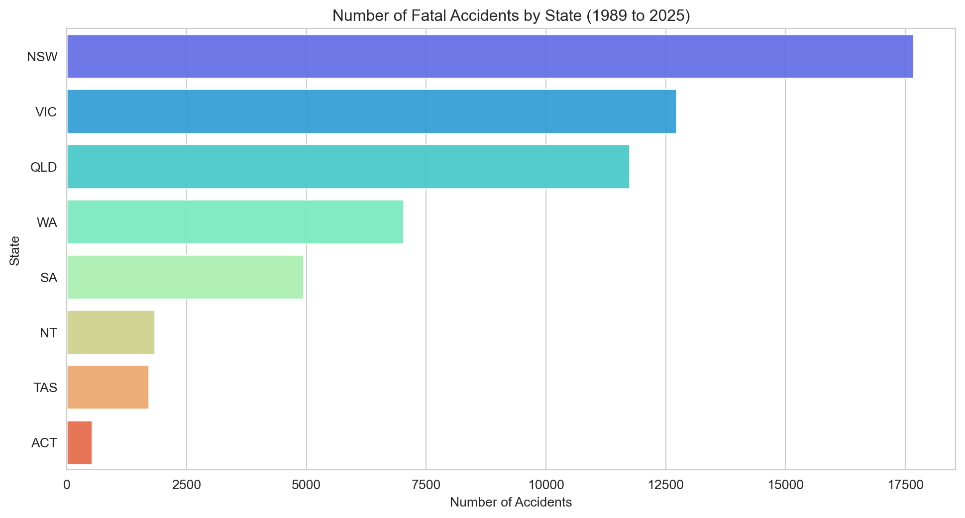
New South Wales, Victoria, and Queensland account for more than 80% of all fatalities.
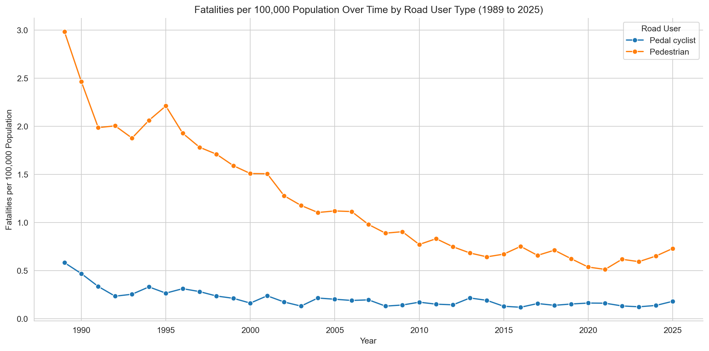
Pedestrian fatalities have decreased over time, but cyclist fatalities have remained relatively constant since the mid-1990s.
Part 1: Data Checking
1.1 Reading Data and Importing Libraries
Import the necessary libraries and read the dataset into a pandas DataFrame. The dataset is in CSV format and contains information about fatal road accidents in Australia from 1989. The dataset is updated monthly and includes various attributes such as the date of the accident, location, vehicle type, and demographic information about the individuals involved in the accidents.
Code
# Set the directory for the scriptimport syssys.path.append("../scripts") # Importing the required librariesimport pandas as pd import numpy as npimport matplotlib.pyplot as pltimport seaborn as snsfrom IPython.display import display# Using Pandas to read the csv file and store it in a dataframedf = pd.read_csv("../data/Crash_Data.csv", low_memory=False)
1.2 Exploring the Data and Checking the Data Types
Briefly inspect to check column names, types, summary statistics, and overall structure.
Code
# View the first and last five rows of the datasetdisplay(df.head())display(df.tail())
Crash ID
State
Month
Year
Dayweek
Time
Crash Type
Bus Involvement
Articulated Truck Involvement
Speed Limit
Road User
Gender
Age
Christmas Period
Easter Period
Month Name
Age Group
Time of day
Day of week
0
120191210344
NSW
8
2019
Friday
19:30:00
Multiple
No
No
80.0
Passenger
Male
88.0
No
No
August
75_or_older
Night
Weekend
1
3346487597363538801
WA
11
2022
Tuesday
20:25:00
Single
No
No
70.0
Driver
Male
53.0
No
No
November
40_to_64
Night
Weekday
2
3199201070009
QLD
1
1992
Tuesday
14:00:00
Single
No
No
100.0
Driver
Female
20.0
No
No
January
17_to_25
Day
Weekday
3
3935365546040620478
VIC
10
2024
Thursday
13:54:00
Multiple
No
No
100.0
Driver
Male
34.0
No
No
October
26_to_39
Day
Weekday
4
2200905020093
VIC
5
2009
Saturday
01:19:00
Single
No
No
80.0
Driver
Male
33.0
No
No
May
26_to_39
Night
Weekend
Crash ID
State
Month
Year
Dayweek
Time
Crash Type
Bus Involvement
Articulated Truck Involvement
Speed Limit
Road User
Gender
Age
Christmas Period
Easter Period
Month Name
Age Group
Time of day
Day of week
58171
2199509170258
VIC
9
1995
Sunday
10:25:00
Single
No
No
80.0
Motorcycle rider
Male
24.0
No
No
September
17_to_25
Day
Weekend
58172
5200910120120
WA
10
2009
Monday
14:30:00
Single
No
No
110.0
Passenger
Female
8.0
No
No
October
0_to_16
Day
Weekday
58173
5201502220022
WA
2
2015
Sunday
07:30:00
Single
No
No
110.0
Passenger
Male
30.0
No
No
February
26_to_39
Day
Weekend
58174
1198901130024
NSW
1
1989
Friday
17:35:00
Multiple
No
Yes
60.0
Driver
Female
62.0
No
No
January
40_to_64
Day
Weekday
58175
3199306170130
QLD
6
1993
Thursday
09:00:00
Multiple
No
No
60.0
Passenger
Male
9.0
No
No
June
0_to_16
Day
Weekday
Code
# Get information about the datasetdisplay(df.info())
<class 'pandas.core.frame.DataFrame'>
RangeIndex: 58176 entries, 0 to 58175
Data columns (total 19 columns):
 #   Column                         Non-Null Count  Dtype
---  ------                         --------------  -----
 0   Crash ID                       58176 non-null  int64
 1   State                          58176 non-null  object
 2   Month                          58176 non-null  int64
 3   Year                           58176 non-null  int64
 4   Dayweek                        58176 non-null  object
 5   Time                           58176 non-null  object
 6   Crash Type                     58167 non-null  object
 7   Bus Involvement                58122 non-null  object
 8   Articulated Truck Involvement  58160 non-null  object
 9   Speed Limit                    56695 non-null  float64
 10  Road User                      58021 non-null  object
 11  Gender                         58144 non-null  object
 12  Age                            58068 non-null  float64
 13  Christmas Period               58176 non-null  object
 14  Easter Period                  58176 non-null  object
 15  Month Name                     58176 non-null  object
 16  Age Group                      58068 non-null  object
 17  Time of day                    58135 non-null  object
 18  Day of week                    58135 non-null  object
dtypes: float64(2), int64(3), object(14)
memory usage: 8.4+ MB
None
Code
# Take the number of rows and columns in the dataset, and the number of unique Crash ID's, and print them out in a sentence.

print(f"Dataset contains {df.shape[0]:,} rows and {df.shape[1]} columns, "f"with {df['Crash ID'].nunique():,} unique crash IDs.")
Dataset contains 58,176 rows and 19 columns, with 52,500 unique crash IDs.
The table below provides a high-level summary of each column, including: - The number of unique values - The most frequently occurring value (where applicable) - The count of that most common value - The number of missing entries
Note: For identifier fields like Crash ID, the “top value” has limited interpretive value, but is more informative in fields such as State or Age.
Code
# Creating and populating a summary dataframe using pandassummary_df = pd.DataFrame({'Column Name': df.columns, # Getting the column names'Unique Values': [df[col].nunique() for col in df.columns], # Counting the number of unique values in each column'Most Common Value': [df[col].mode()[0] for col in df.columns], # Finding the most common value in each column using mode function'Count of Most Common Value': [df[col].value_counts().iloc[0] for col in df.columns], # Counting the number of times the most common value appears in each column'Missing Values': df.isnull().sum().values # Counting the number of blank values in each column})# Displaying the summary dataframedisplay(summary_df)
Column Name
Unique Values
Most Common Value
Count of Most Common Value
Missing Values
0
Crash ID
52500
1198912220772
35
0
1
State
8
NSW
17668
0
2
Month
12
12
5277
0
3
Year
37
1989
2800
0
4
Dayweek
7
Saturday
10529
0
5
Time
1425
15:00:00
1247
0
6
Crash Type
2
Single
32157
9
7
Bus Involvement
2
No
57059
54
8
Articulated Truck Involvement
2
No
52378
16
9
Speed Limit
16
100.0
19862
1481
10
Road User
6
Driver
26234
155
11
Gender
2
Male
41826
32
12
Age
102
18.0
2062
108
13
Christmas Period
2
No
56358
0
14
Easter Period
2
No
57820
0
15
Month Name
12
December
5277
0
16
Age Group
6
40_to_64
15047
108
17
Time of day
2
Day
33355
41
18
Day of week
2
Weekday
34349
41
47,567 unique crashes resulted in 52,843 fatalities — some events claimed multiple lives. The deadliest single crash on record involved 35 deaths (the 1989 Kempsey bus disaster).
Code
# Calculate statistics for the 'Age' columnmean_age = df['Age'].mean()median_age = df['Age'].median()min_age = df['Age'].min()max_age = df['Age'].max()print(f"The average age of individuals involved in fatal road crashes was {mean_age:.1f} years "f"(median: {median_age}, range: {min_age}–{max_age}).")
The average age of individuals involved in fatal road crashes was 40.3 years (median: 35.0, range: 0.0–101.0).
Part 2: Data Preparation
2.1 Checking for null or missing values
From information provided in the ARDD data dictionary we know that missing values are represented by ‘-9’, ‘Unspecified’ or ‘Other/-9’. We will search for these values and replace them with null values (NaN).
Code
# Firstly, we will find the number of blank values in the datasetblank_values = df.isnull().sum()# Secondly, we will find the number of values set to '-9' which according to the data book are also missing data. neg_nine_values = df.isin([-9, 'Other/-9']).sum()# Thirdly there are a handful of 'Unspecified' value in the dataset, so we will also sum themunspecified_values = (df =="Unspecified").sum()# We will now sum all the missing valuestotal_missing = blank_values + neg_nine_values + unspecified_values# Displaying counts of blank, '-9', 'unspecified', and total missing values per columnmissing_data_summary = pd.DataFrame({'Blank Values': blank_values,'-9 Values': neg_nine_values,'Unspecified Values': unspecified_values,'Total of Missing Values': total_missing})display(missing_data_summary)
Blank Values
-9 Values
Unspecified Values
Total of Missing Values
Crash ID
0
0
0
0
State
0
0
0
0
Month
0
0
0
0
Year
0
0
0
0
Dayweek
0
0
0
0
Time
0
0
0
0
Crash Type
9
0
0
9
Bus Involvement
54
0
0
54
Articulated Truck Involvement
16
0
0
16
Speed Limit
1481
0
0
1481
Road User
155
0
0
155
Gender
32
0
0
32
Age
108
0
0
108
Christmas Period
0
0
0
0
Easter Period
0
0
0
0
Month Name
0
0
0
0
Age Group
108
0
0
108
Time of day
41
0
0
41
Day of week
41
0
0
41
Null or missing values will be replaced with NaN for easier analysis and columns with high proportions of missing data will be dropped from further analysis to ensure data quality and avoid skewed interpretations.
Heavy Rigid Truck Involvement, National Remoteness Areas, SA4 Name 2016, National LGA Name 2017, and National Road Type will be dropped.
2.2 Data Cleaning
Data is cleaned using a script that: - Replaces missing values with NaN. - Map numeric month values to month names and create a new column for month names. - Drops columns with high proportions of missing data. - Drops entries from the current year as that data is not yet complete.
Code
from data_cleaning import full_clean_pipelinedf = full_clean_pipeline(df)# Create a dynamic year variable to get the latest year in the dataset to use in the analysislatest_year = df['Year'].max()earliest_year = df['Year'].min()print(f"The dataset contains data from {earliest_year} to {latest_year}.")
The dataset contains data from 1989 to 2025.
2.3 Visualise the Remaining Missing Data
A quick visualisation of the remaining missing data will be created to help identify any remaining issues.
Code
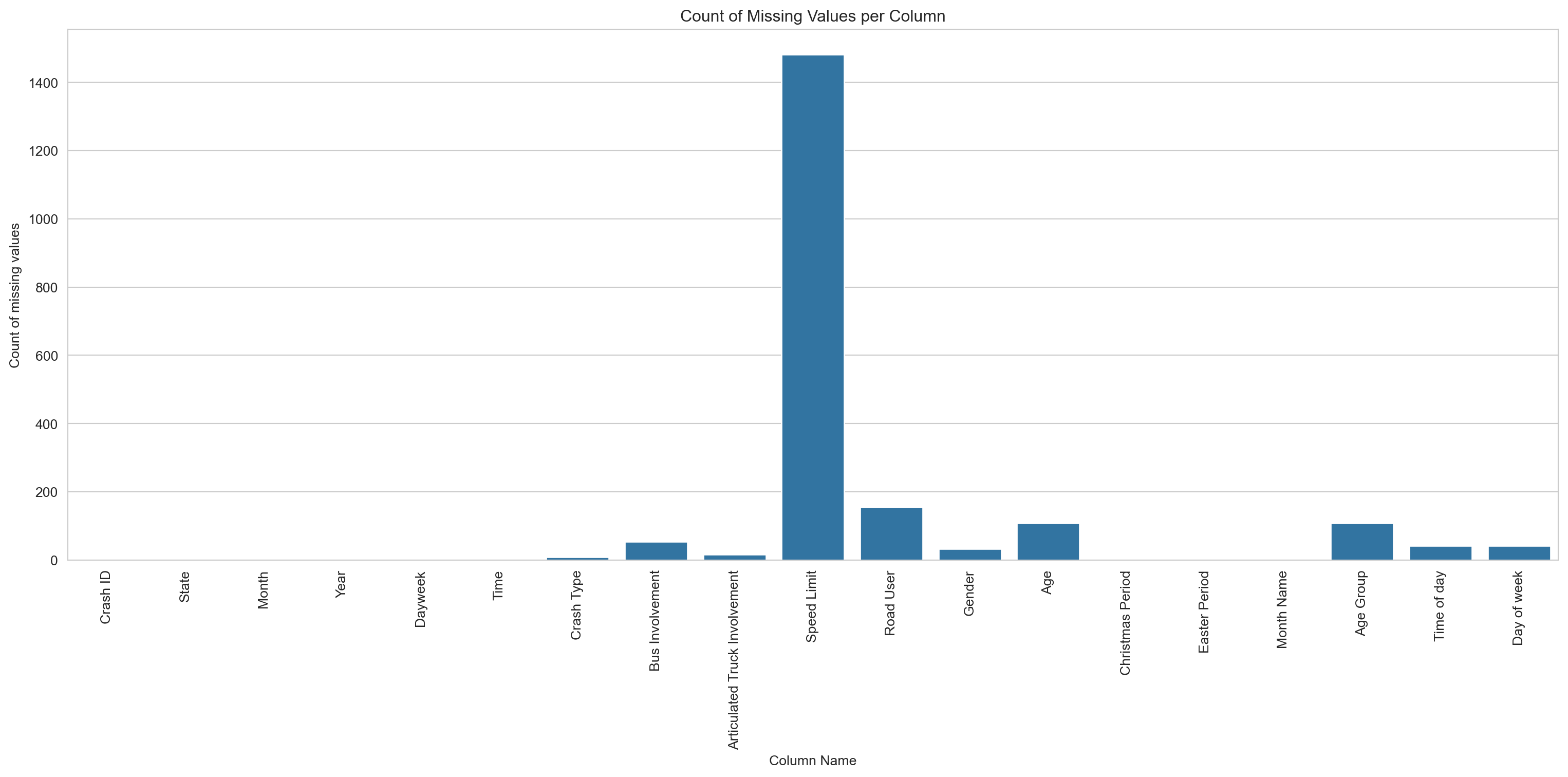
# Creating a bar chart of the missing datasns.set_style('whitegrid')missing_value_count = df.isnull().sum() # We could instead call on the missing_data_summary dataframe using the 'total_missing' column, but defining a new variable is easier to read and shorter to typeplt.figure(figsize=(16,8))sns.barplot(x=missing_value_count.index, y=missing_value_count)plt.title('Count of Missing Values per Column')plt.xlabel('Column Name')plt.ylabel('Count of missing values')plt.xticks(rotation=90)plt.tight_layout()plt.show()
The count chart is hard to read — a couple of columns dominate. The percentage view below (capped at 10%) makes the smaller gaps easier to see.
Code
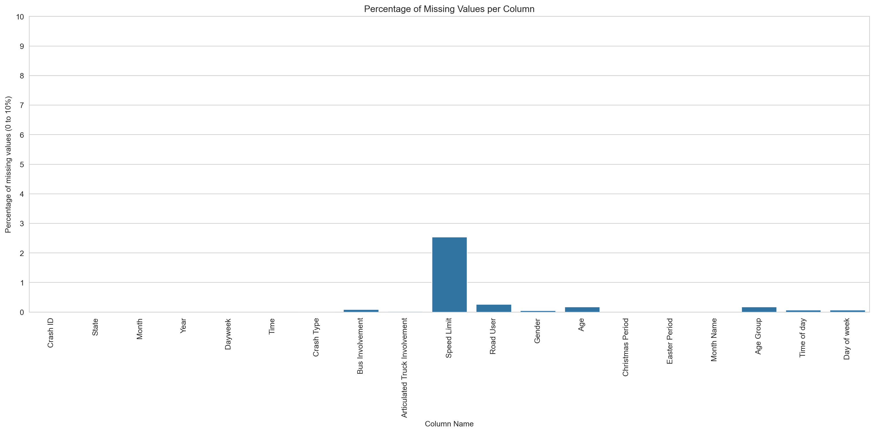
# Creating a bar chart of the percentage of missing datasns.set_style('whitegrid')missing_values_percentage = (missing_value_count /len(df)) *100plt.figure(figsize=(16,8))sns.barplot(x=missing_values_percentage.index, y=missing_values_percentage)plt.title('Percentage of Missing Values per Column')plt.xlabel('Column Name')plt.ylabel('Percentage of missing values (0 to 10%)')plt.xticks(rotation=90)plt.yticks(range(0, 11, 1))plt.tight_layout()plt.show()
Speed limit has the highest share of missing values at around 2.6%. Everything else is under 0.5% — low enough to leave in place and handle on a chart-by-chart basis.
2.4 Check for Duplicate Entries
Code
# Checking for duplicate rowsduplicate_rows = df[df.duplicated()]display(duplicate_rows)# Checking for duplicate values in the Crash ID columnduplicate_crash_ids = df[df.duplicated(['Crash ID'])]display(duplicate_crash_ids)
Crash ID
State
Month
Year
Dayweek
Time
Crash Type
Bus Involvement
Articulated Truck Involvement
Speed Limit
Road User
Gender
Age
Christmas Period
Easter Period
Month Name
Age Group
Time of day
Day of week
4760
3199410240286
QLD
10
1994
Monday
10:00:00
Single
Yes
No
100.0
Passenger
Female
72.0
No
No
October
65_to_74
Day
Weekday
5234
1199107070301
NSW
7
1991
Sunday
23:30:00
Single
No
No
60.0
Passenger
Male
18.0
No
No
July
17_to_25
Night
Weekend
5439
6198901110004
TAS
1
1989
Wednesday
20:20:00
Multiple
No
Yes
100.0
Passenger
Male
13.0
No
No
January
0_to_16
Night
Weekday
6650
320201179894
QLD
6
2020
Sunday
04:00:00
Single
No
No
70.0
Passenger
Female
14.0
No
No
June
0_to_16
Night
Weekend
6797
2201111120221
VIC
11
2011
Saturday
12:37:00
Multiple
No
No
100.0
Passenger
Female
20.0
No
No
November
17_to_25
Day
Weekend
...
...
...
...
...
...
...
...
...
...
...
...
...
...
...
...
...
...
...
...
57433
3200011160243
QLD
11
2000
Thursday
15:00:00
Multiple
No
No
100.0
Passenger
Female
68.0
No
No
November
65_to_74
Day
Weekday
57502
3199903110042
QLD
3
1999
Thursday
21:00:00
Multiple
No
Yes
60.0
Passenger
Female
17.0
No
No
March
17_to_25
Night
Weekday
57746
4201501220007
SA
1
2015
Thursday
16:44:00
Multiple
No
Yes
110.0
Passenger
Male
33.0
No
No
January
26_to_39
Day
Weekday
57805
4201001120005
SA
1
2010
Tuesday
13:20:00
Multiple
No
No
100.0
Passenger
Female
10.0
No
No
January
0_to_16
Day
Weekday
58124
72017150290
NT
2
2017
Saturday
02:26:00
Multiple
No
No
100.0
Pedestrian
Male
15.0
No
No
February
0_to_16
Night
Weekend
166 rows × 19 columns
Crash ID
State
Month
Year
Dayweek
Time
Crash Type
Bus Involvement
Articulated Truck Involvement
Speed Limit
Road User
Gender
Age
Christmas Period
Easter Period
Month Name
Age Group
Time of day
Day of week
828
1200008150335
NSW
8
2000
Tuesday
14:30:00
Multiple
No
Yes
100.0
Passenger
Female
24.0
No
No
August
17_to_25
Day
Weekday
880
1198911140670
NSW
11
1989
Tuesday
16:10:00
Single
No
No
60.0
Passenger
Female
34.0
No
No
November
26_to_39
Day
Weekday
1053
1199803100082
NSW
3
1998
Tuesday
15:30:00
Multiple
No
No
100.0
Driver
Male
52.0
No
No
March
40_to_64
Day
Weekday
1101
3199307300180
QLD
7
1993
Friday
00:00:00
Single
No
No
60.0
Passenger
Male
44.0
No
No
July
40_to_64
Night
Weekday
1207
4201813570
WA
1
2018
Wednesday
12:14:00
Multiple
No
No
110.0
Driver
Female
49.0
No
No
January
40_to_64
Day
Weekday
...
...
...
...
...
...
...
...
...
...
...
...
...
...
...
...
...
...
...
...
58139
1198910110598
NSW
10
1989
Wednesday
21:15:00
Single
No
No
100.0
Driver
Female
17.0
No
No
October
17_to_25
Night
Weekday
58145
4201913952
WA
5
2019
Thursday
00:29:00
Single
No
No
NaN
Pedestrian
Female
23.0
No
No
May
17_to_25
Night
Weekday
58161
3201105130075
QLD
5
2011
Friday
23:00:00
Single
No
No
60.0
Driver
Male
27.0
No
No
May
26_to_39
Night
Weekend
58172
5200910120120
WA
10
2009
Monday
14:30:00
Single
No
No
110.0
Passenger
Female
8.0
No
No
October
0_to_16
Day
Weekday
58175
3199306170130
QLD
6
1993
Thursday
09:00:00
Multiple
No
No
60.0
Passenger
Male
9.0
No
No
June
0_to_16
Day
Weekday
5676 rows × 19 columns
In this dataset, Crash IDs represent a single event, but there are multiple rows for each Crash ID in some cases when there have been multiple fatalities in a crash. Since there appears to be no true duplicate rows, we will not drop any rows from the dataset.
2.5 Checking for Outliers
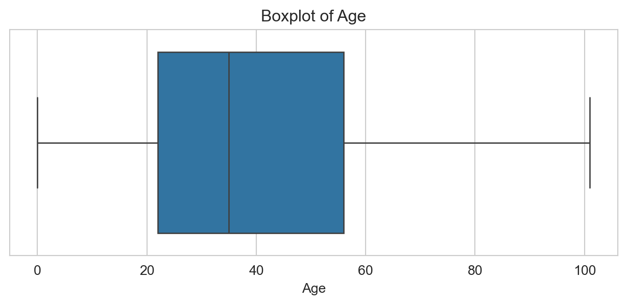
In this dataset we have a single continuous variable of interest, age. We will use a boxplot to check for outliers in this column.
Code
# Creating a boxplot to check for outliers in the Age columnplt.figure(figsize=(8,3))sns.boxplot(x=df['Age'])plt.title('Boxplot of Age')plt.xlabel('Age')plt.show()
No outliers visible. The IQR check below confirms this.
Code
# Creating a function to calculate the IRQdef IRQ_and_bounds(column): Q1 = column.quantile(0.25) Q3 = column.quantile(0.75) IRQ = Q3 - Q1 lower_bound = Q1 - (1.5* IRQ) upper_bound = Q3 + (1.5* IRQ)return IRQ, lower_bound, upper_bound# Using the IRQ function to calculate the IRQ of the Age columnIRQ_and_bounds(df['Age'])# Using the IRQ function to check for outliers in the Age columnirq_value, lower_bound, upper_bound = IRQ_and_bounds(df['Age'])print(f"IRQ: {irq_value}, Lower Bound: {lower_bound}, Upper Bound: {upper_bound}")# Using the IRQ function to check for outliers in the Age columndef identify_outliers(column): _, lower_bound, upper_bound = IRQ_and_bounds(column) outliers = column[(column < lower_bound) | (column > upper_bound)]return outliersoutliers = identify_outliers(df['Age'])print(f"Outliers: {outliers.values}")
This section explores patterns in fatal road transport accidents in Australia from 1989 to 2025. Each row in the dataset represents a single fatality and includes demographic, geographic, and temporal details.
The visualisations aim to examine:
The demographic characteristics of individuals involved in fatal crashes
The geographic distribution of fatal incidents across Australian states and territories
Temporal trends, including changes over time and differences by day of week or time of year
Shifts in the demographic profile of fatalities over time
Trends in pedestrian and cyclist fatalities, and whether these have changed meaningfully since 1989
These visual insights provide context for evaluating the impact of road safety initiatives and identifying groups most at risk.
3.1 Demographic Analysis of Fatal Road Accidents in Australia
Code
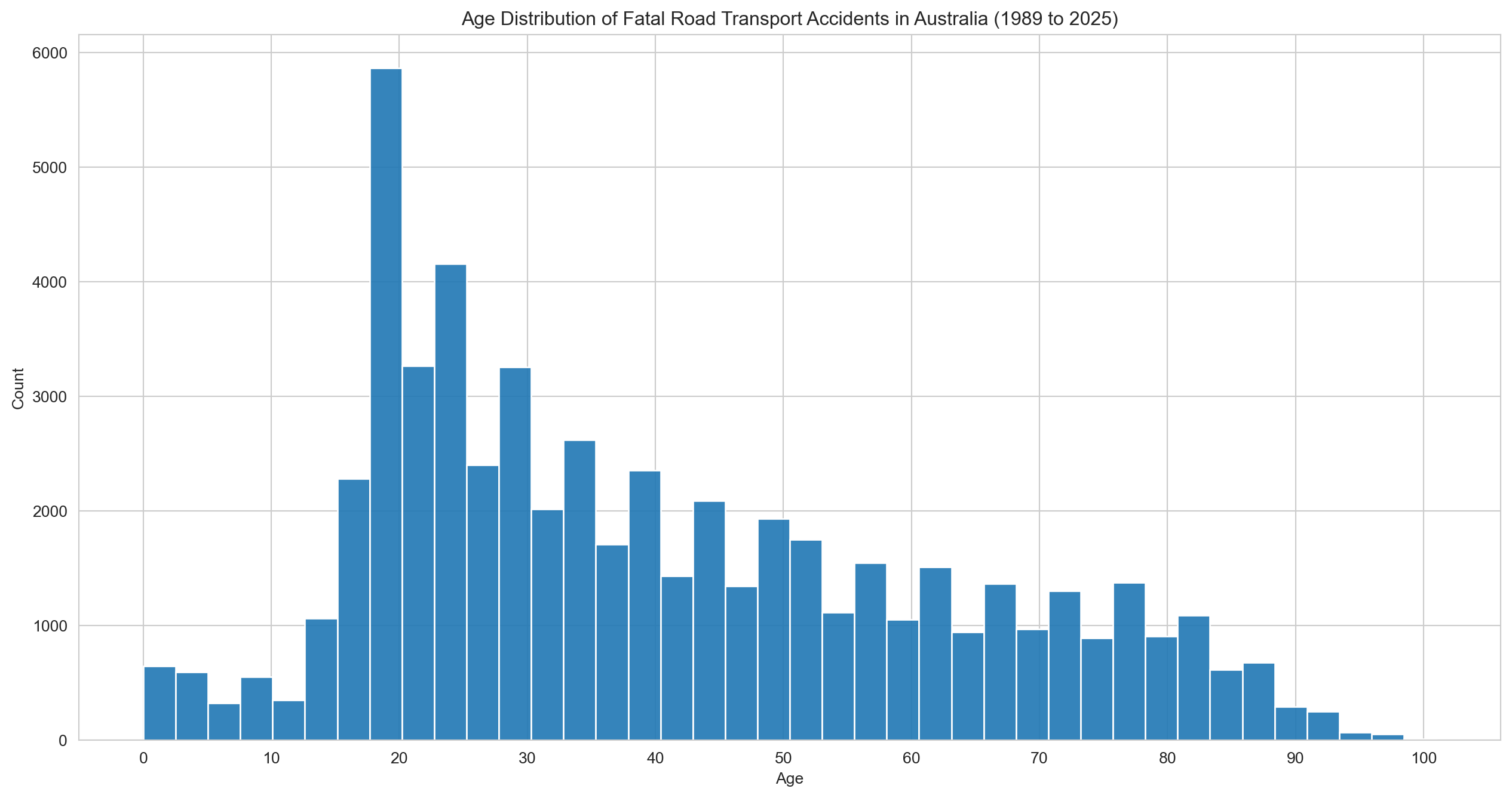
# Age and Sex distribution of fatal road transport accidents in Australiasns.set_style('whitegrid')plt.figure(figsize=(16,8))sns.histplot(df['Age'], bins=40, kde=False, alpha=0.9)plt.title(f"Age Distribution of Fatal Road Transport Accidents in Australia ({earliest_year} to {latest_year})")plt.xlabel('Age')plt.xticks(range(0, 101, 10))plt.ylabel('Count')plt.show()
Fatalities peak sharply among people in their early 20s, then taper off steadily with age.
Code
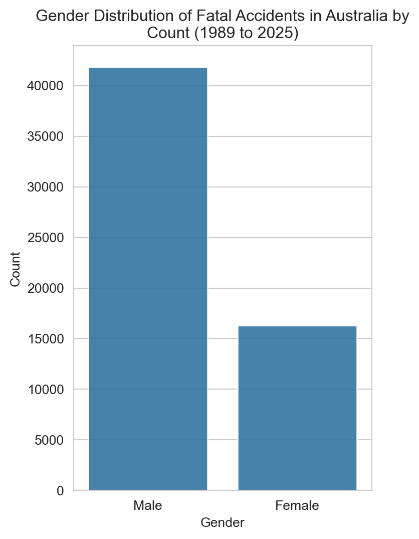
# Plot of fatal accidents by gendersns.set_style('whitegrid')plt.figure(figsize=(4,6))sns.countplot(x='Gender', data=df, alpha=0.9)plt.title(f"Gender Distribution of Fatal Accidents in Australia by\nCount ({earliest_year} to {latest_year})")plt.xlabel('Gender')plt.ylabel('Count')plt.show()
Males make up the clear majority — the chart below expresses this as a percentage.
Code
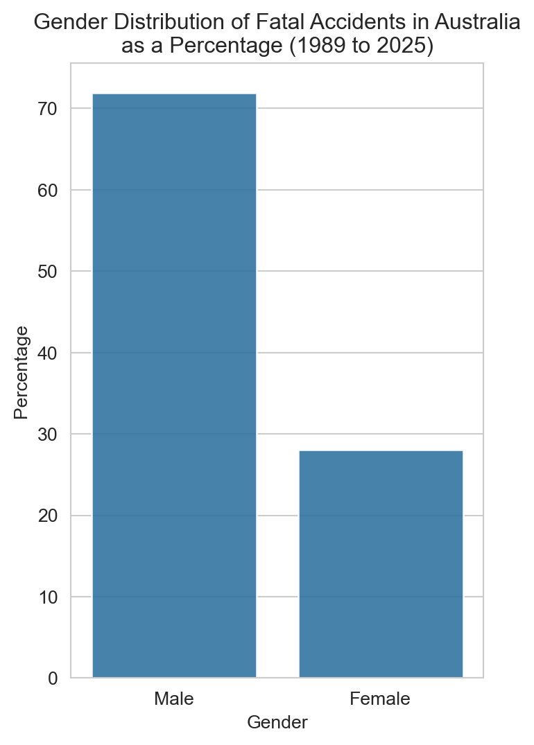
# Gender distribution of fatal accidents by gender as a percentagegender_percentage = (df['Gender'].value_counts(normalize=True) *100).reset_index()gender_percentage.columns = ['Gender', 'Percentage']# Plottingplt.figure(figsize=(4,6))sns.set_style('whitegrid')sns.barplot(x='Gender', y='Percentage', data=gender_percentage, alpha=0.9)plt.title(f"Gender Distribution of Fatal Accidents in Australia\nas a Percentage ({earliest_year} to {latest_year})")plt.xlabel('Gender')plt.ylabel('Percentage')plt.show()
Around 70% of road fatalities are male — a ratio that, as we’ll see later, has stayed remarkably consistent over time.
Code
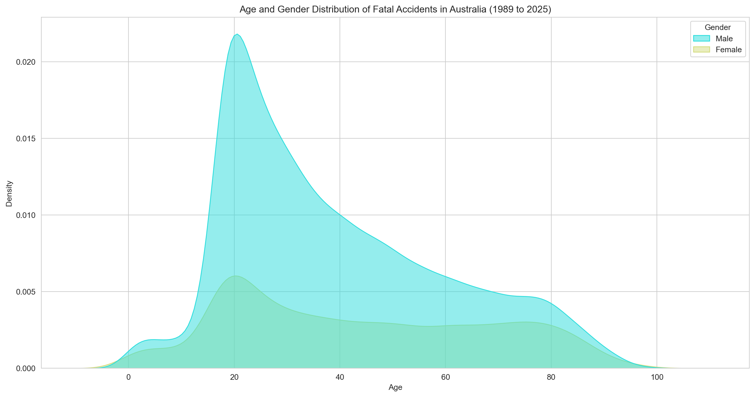
# Density plot of age and genderplt.figure(figsize=(16,8))sns.set_style('whitegrid')sns.kdeplot(data=df, x='Age', hue='Gender', fill=True, palette='rainbow', alpha=0.5)plt.title(f"Age and Gender Distribution of Fatal Accidents in Australia ({earliest_year} to {latest_year})")plt.xlabel('Age')plt.ylabel('Density')plt.show()
Both genders peak around age 20 and follow a broadly similar distribution. The difference is largely one of scale, not shape.
Code
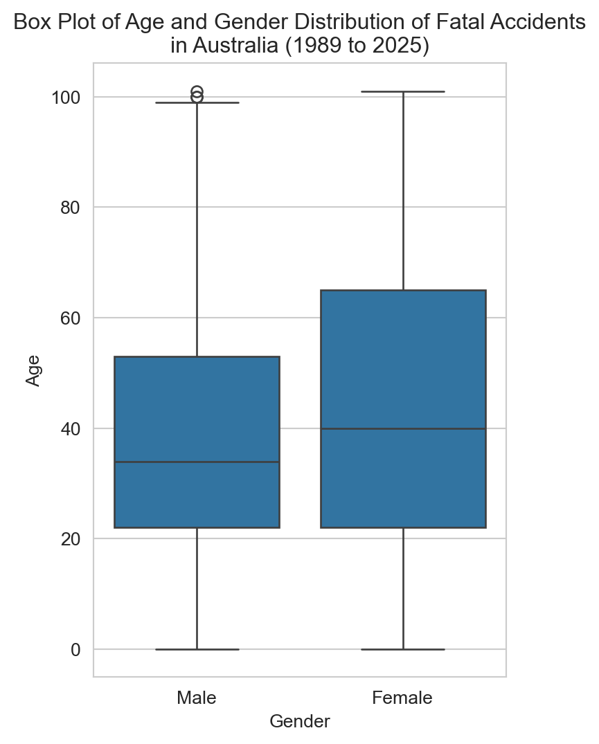
# Box plot of age and gender distributionplt.figure(figsize=(4,6))sns.set_style('whitegrid')sns.boxplot(x='Gender', y='Age', data=df)plt.title(f"Box Plot of Age and Gender Distribution of Fatal Accidents\nin Australia ({earliest_year} to {latest_year})")plt.xlabel('Gender')plt.ylabel('Age')plt.show()
Male fatalities skew slightly older at the median, with a handful of outliers at the upper end.
Code
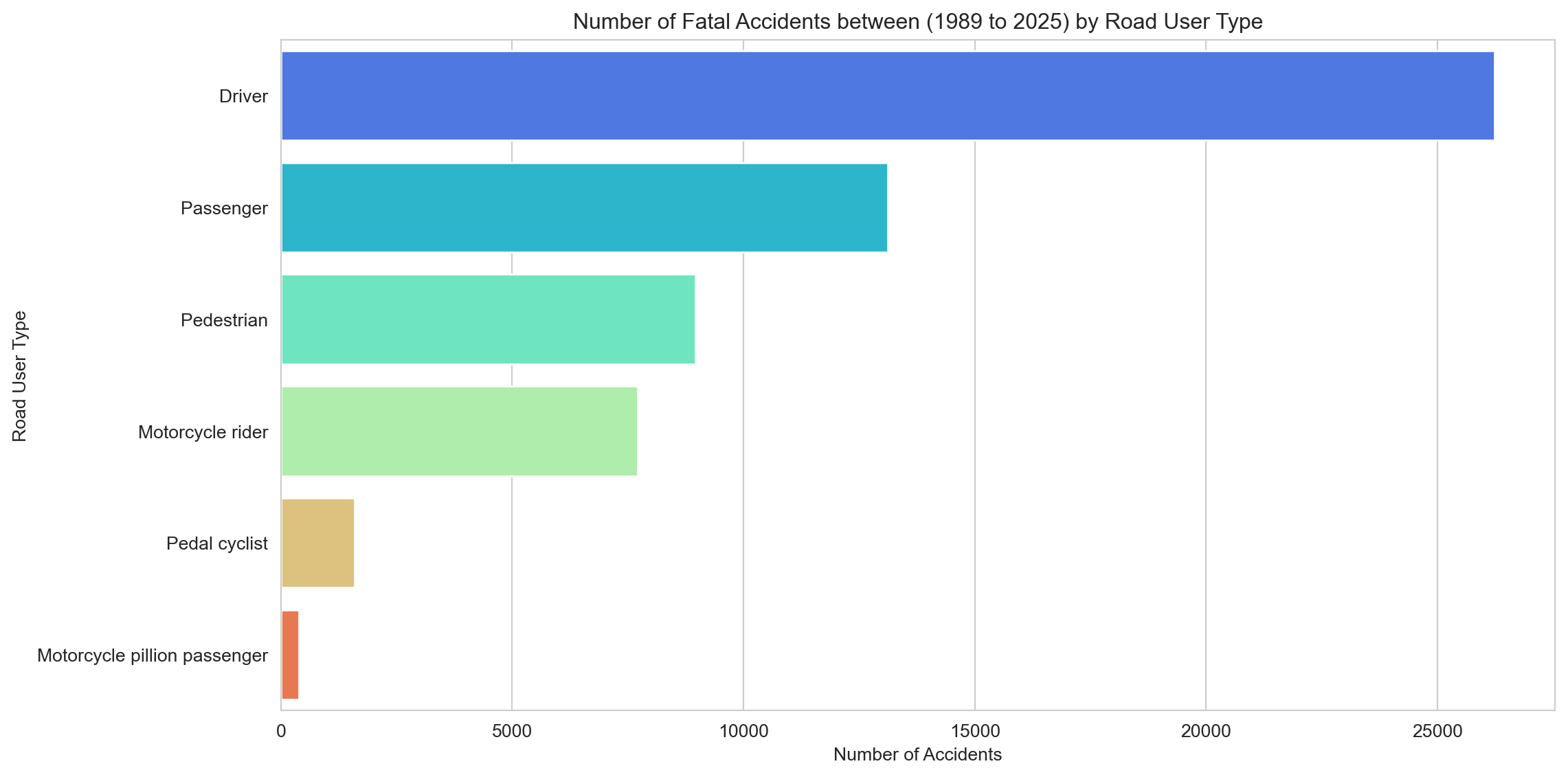
# Calculate the number of accidents by road userroad_user_counts = df['Road User'].value_counts().reset_index()road_user_counts.columns = ['Road User', 'Accidents']# Fatalities by Road User Typesns.set_style('whitegrid')plt.figure(figsize=(12,6))sns.barplot(x='Accidents', y='Road User', data=road_user_counts, hue='Road User', palette='rainbow')plt.title(f"Number of Fatal Accidents between ({earliest_year} to {latest_year}) by Road User Type")plt.xlabel('Number of Accidents')plt.ylabel('Road User Type')plt.tight_layout()plt.show()
Drivers and passengers make up the bulk of fatalities — unsurprisingly, given how many more cars there are on the road than anything else. Pedestrians and motorcyclists follow, and both are examined in more detail in the sub-analyses.
Code
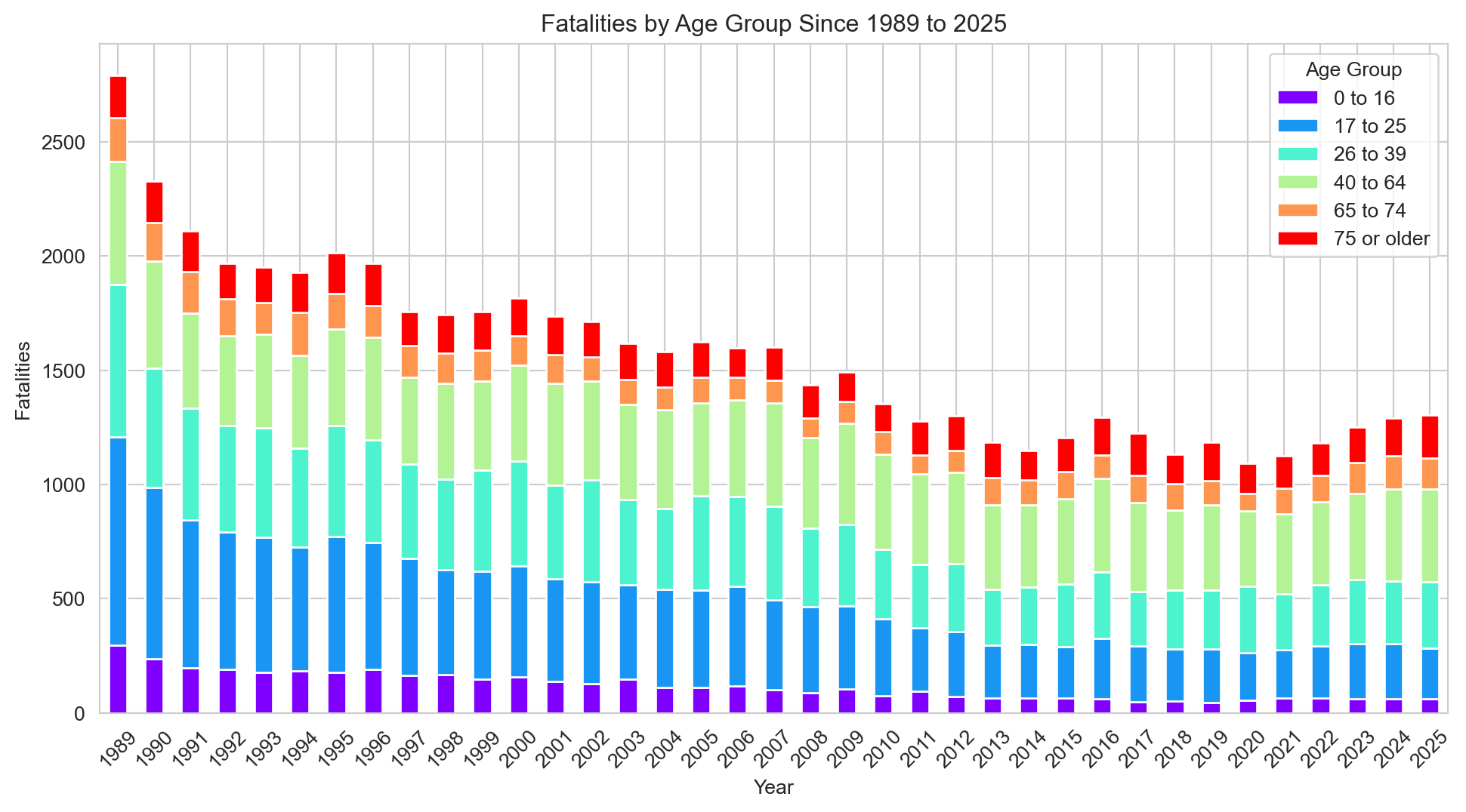
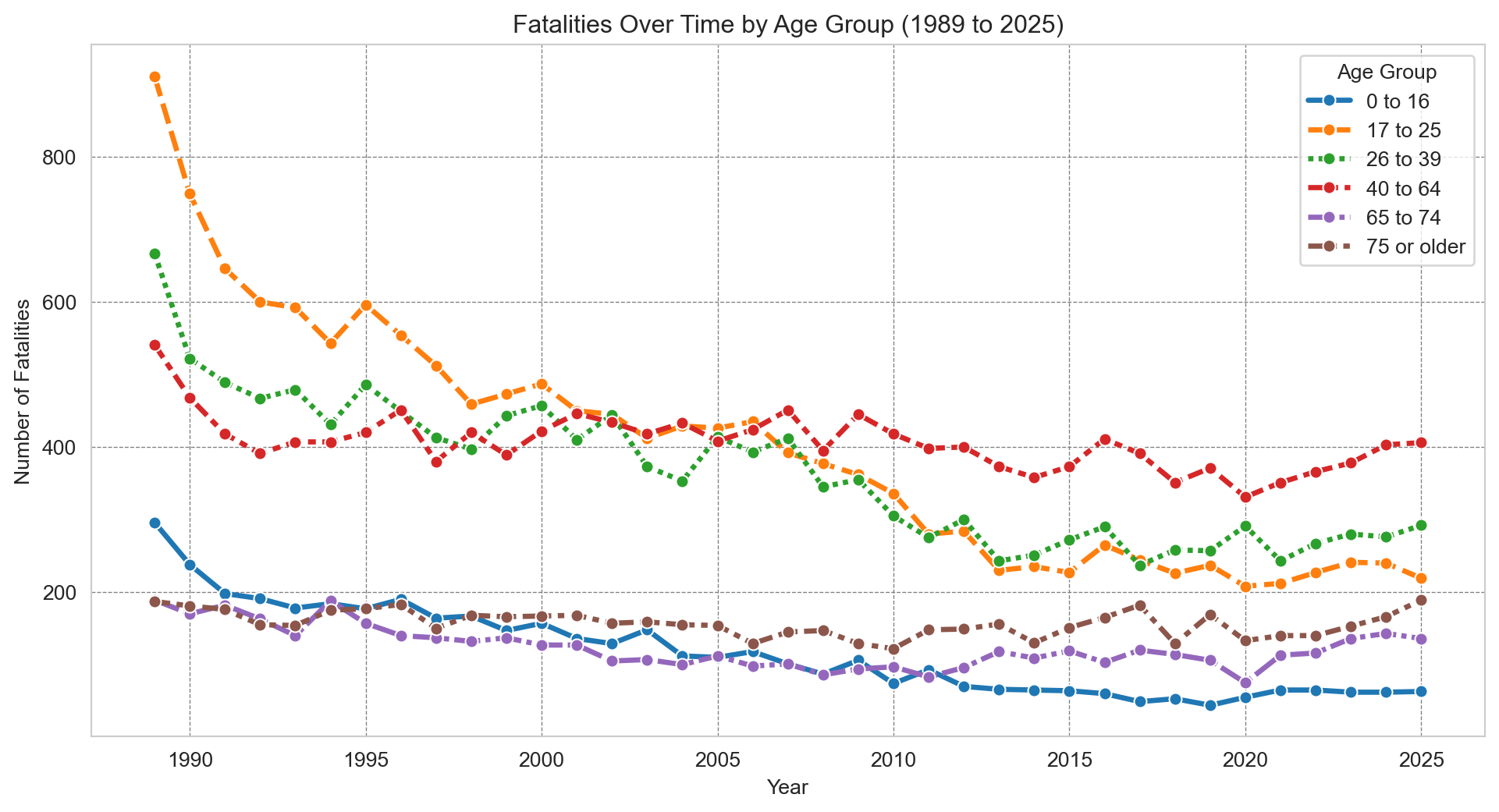
# Calculate the number of accidents by road userage_group_fatalities = df.groupby(['Year', 'Age Group'], observed=True)['Crash ID'].size().reset_index(name='Fatalities')# Using a pivot table to transform the data into wide formatage_group_fatalities_pivot = age_group_fatalities.pivot(index='Year', columns='Age Group', values='Fatalities')age_group_fatalities_pivot.columns = age_group_fatalities_pivot.columns.str.replace('_', ' ') # Remove underscores from column names so they appear more nearly in the legend# Plottingsns.set_style('whitegrid')age_group_fatalities_pivot.plot(kind='bar', stacked=True, figsize=(12, 6), cmap='rainbow')plt.title(f"Fatalities by Age Group Since {earliest_year} to {latest_year}")plt.xticks(rotation=45)plt.xlabel('Year')plt.ylabel('Fatalities')plt.legend(title='Age Group')plt.show()
Fatalities have fallen across all age groups since 1989, with the proportional mix between groups staying broadly consistent.
Code
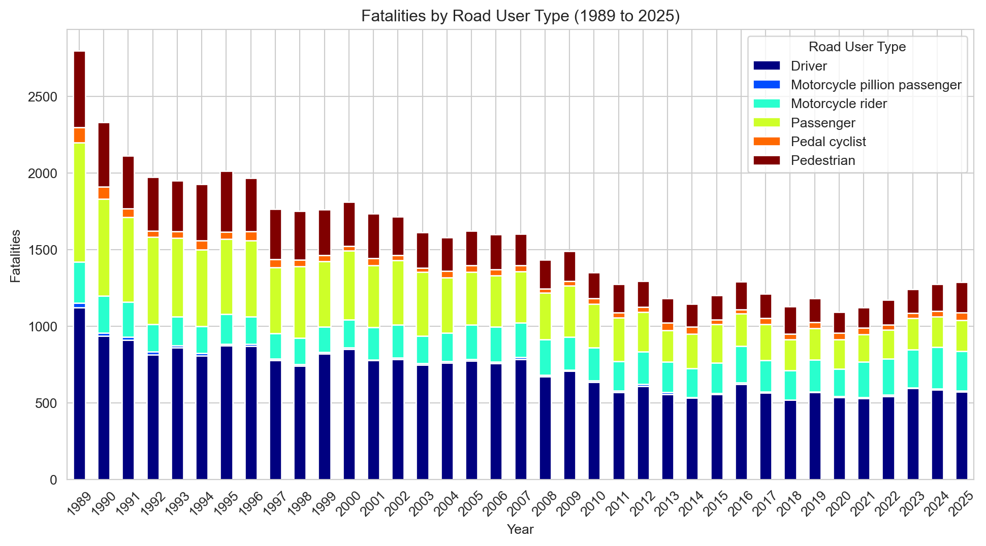
# Calculate the number of accidents by road user road_user_fatalities = df.groupby(['Year', 'Road User'])['Crash ID'].size().reset_index(name='Fatalities')# Using a pivot table to transform the data into wide formatroad_user_fatalities_pivot = road_user_fatalities.pivot(index='Year', columns='Road User', values='Fatalities')# Plottingsns.set_style('whitegrid')road_user_fatalities_pivot.plot(kind='bar', stacked=True, figsize=(12, 6), cmap='jet')plt.title(f"Fatalities by Road User Type ({earliest_year} to {latest_year})")plt.xlabel('Year')plt.ylabel('Fatalities')plt.xticks(rotation=45)plt.legend(title='Road User Type')plt.show()
The same broad decline holds across all road user types, with no major shifts in the relative mix over time.
3.2 Geographic Analysis of Fatal Road Accidents in Australia
Code
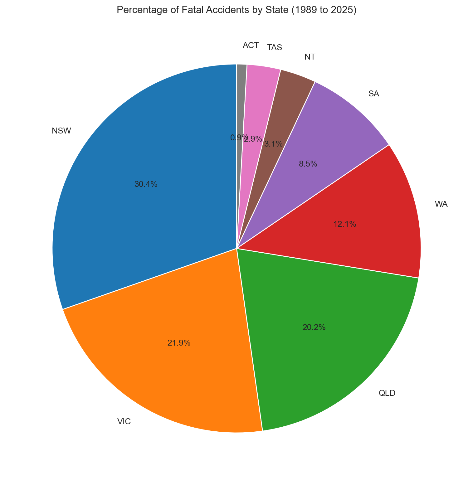
# Pie chart of fatal accidents by State# Firstly, calculate the number of accidents by state. state_counts = df['State'].value_counts().reset_index()state_counts.columns = ['State', 'Accidents']plt.figure(figsize=(10,10))plt.pie(x=state_counts['Accidents'], labels=state_counts['State'], autopct='%1.1f%%', startangle=90)plt.title(f"Percentage of Fatal Accidents by State ({earliest_year} to {latest_year})")plt.show()
NSW, Victoria, and Queensland together account for around 80% of fatalities — broadly in line with their share of the national population.
Code
# Bar chart of fatal accidents by Statesns.set_style('whitegrid')plt.figure(figsize=(12,6))sns.barplot(x='Accidents', y='State', data=state_counts, hue='State', alpha=0.9, palette='rainbow')plt.title(f"Number of Fatal Accidents by State ({earliest_year} to {latest_year})")plt.xlabel('Number of Accidents')plt.ylabel('State')plt.show()
Same data, different format — easier to compare state counts directly.
3.3 Temporal Analysis of Fatal Road Accidents in Australia
Accidents by Month of Year
Code
# Now we will calculate the number of accidents by monthmonth_counts = df['Month Name'].value_counts().reset_index()month_counts.columns = ['Month', 'Accidents']# Sorting the months in order by converting them to a categorical variable and sorting by the month ordermonth_order = ['January', 'February', 'March', 'April', 'May', 'June', 'July','August', 'September', 'October', 'November', 'December']month_counts['Month'] = pd.Categorical(month_counts['Month'], categories=month_order, ordered=True)month_counts = month_counts.sort_values('Month')
Code
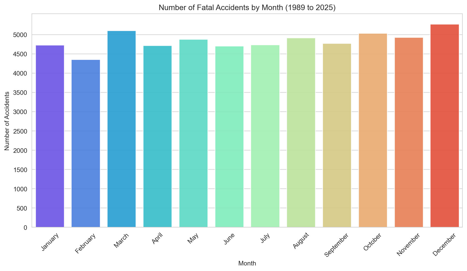
# Plot the number of accidents by monthsns.set_style('whitegrid')plt.figure(figsize=(12,6))sns.barplot(x='Month', y='Accidents', data=month_counts, hue='Month', palette='rainbow', alpha=0.9)plt.title(f"Number of Fatal Accidents by Month ({earliest_year} to {latest_year})")plt.xlabel('Month')plt.ylabel('Number of Accidents')plt.xticks(rotation=45)plt.yticks(range(0, 5500, 500))plt.show()
Fatalities are fairly evenly distributed throughout the year, with a modest uptick in December and March — both associated with increased traffic volumes and holiday travel.
Code
# Count accidents by day of the weekday_counts = df['Dayweek'].value_counts().reset_index()day_counts.columns = ['Day', 'Accidents']# Sort the days in orderday_order = ['Monday', 'Tuesday', 'Wednesday', 'Thursday', 'Friday', 'Saturday', 'Sunday']day_counts['Day'] = pd.Categorical(day_counts['Day'], categories=day_order, ordered=True)day_counts = day_counts.sort_values('Day')
Code
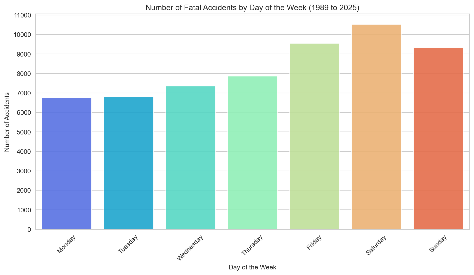
# Plot the number of accidents by day of the weeksns.set_style('whitegrid')plt.figure(figsize=(12,6))sns.barplot(x='Day', y='Accidents', data=day_counts, hue='Day', palette='rainbow', alpha=0.9)plt.title(f"Number of Fatal Accidents by Day of the Week ({earliest_year} to {latest_year})")plt.xlabel('Day of the Week')plt.yticks(range(0, 12000, 1000))plt.ylabel('Number of Accidents')plt.xticks(rotation=45)plt.show()
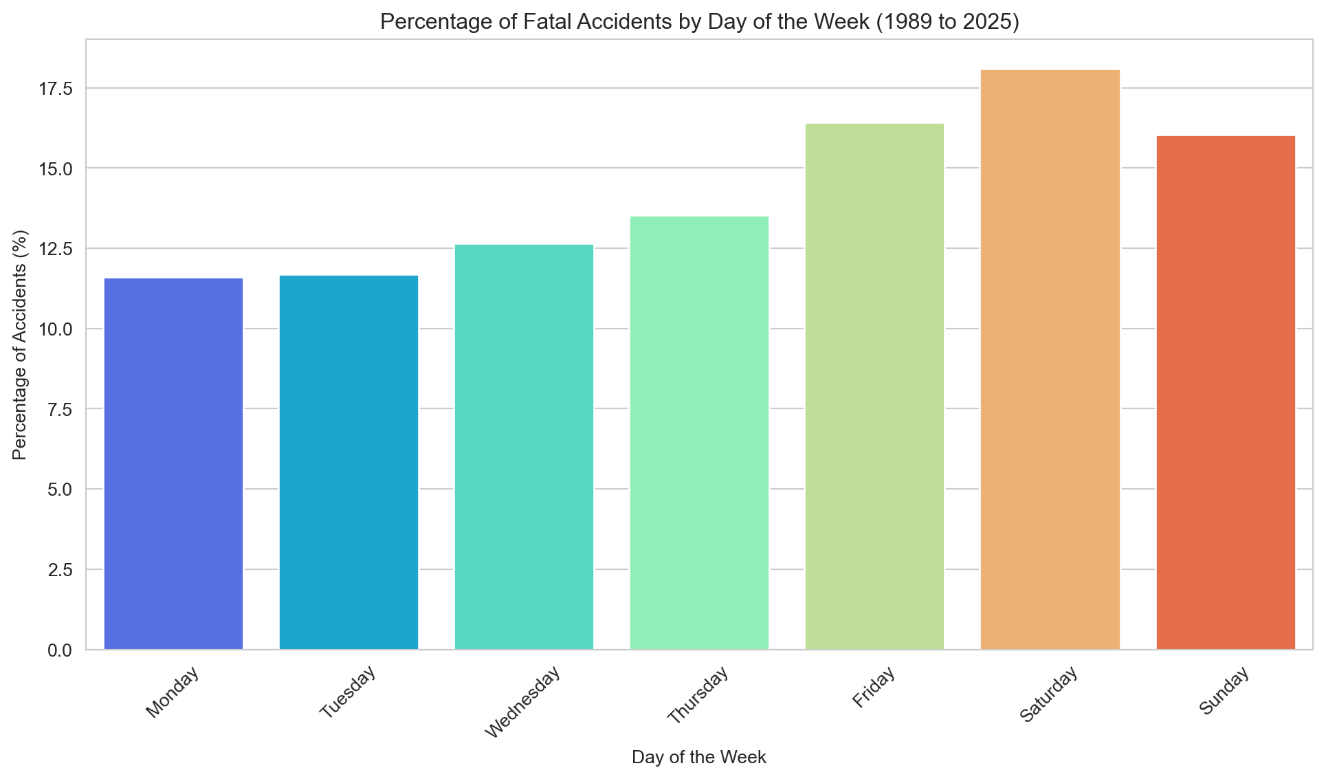
Saturday records the most fatalities, followed by Friday and Sunday. The weekend effect is clear and consistent.
Code
day_counts['Percentage'] = (day_counts['Accidents'] / day_counts['Accidents'].sum()) *100sns.set_style('whitegrid')plt.figure(figsize=(12,6))sns.barplot(x='Day', y='Percentage', data=day_counts, hue='Day', palette='rainbow')plt.title(f"Percentage of Fatal Accidents by Day of the Week ({earliest_year} to {latest_year})")plt.xlabel('Day of the Week')plt.ylabel('Percentage of Accidents (%)')plt.xticks(rotation=45)plt.show()
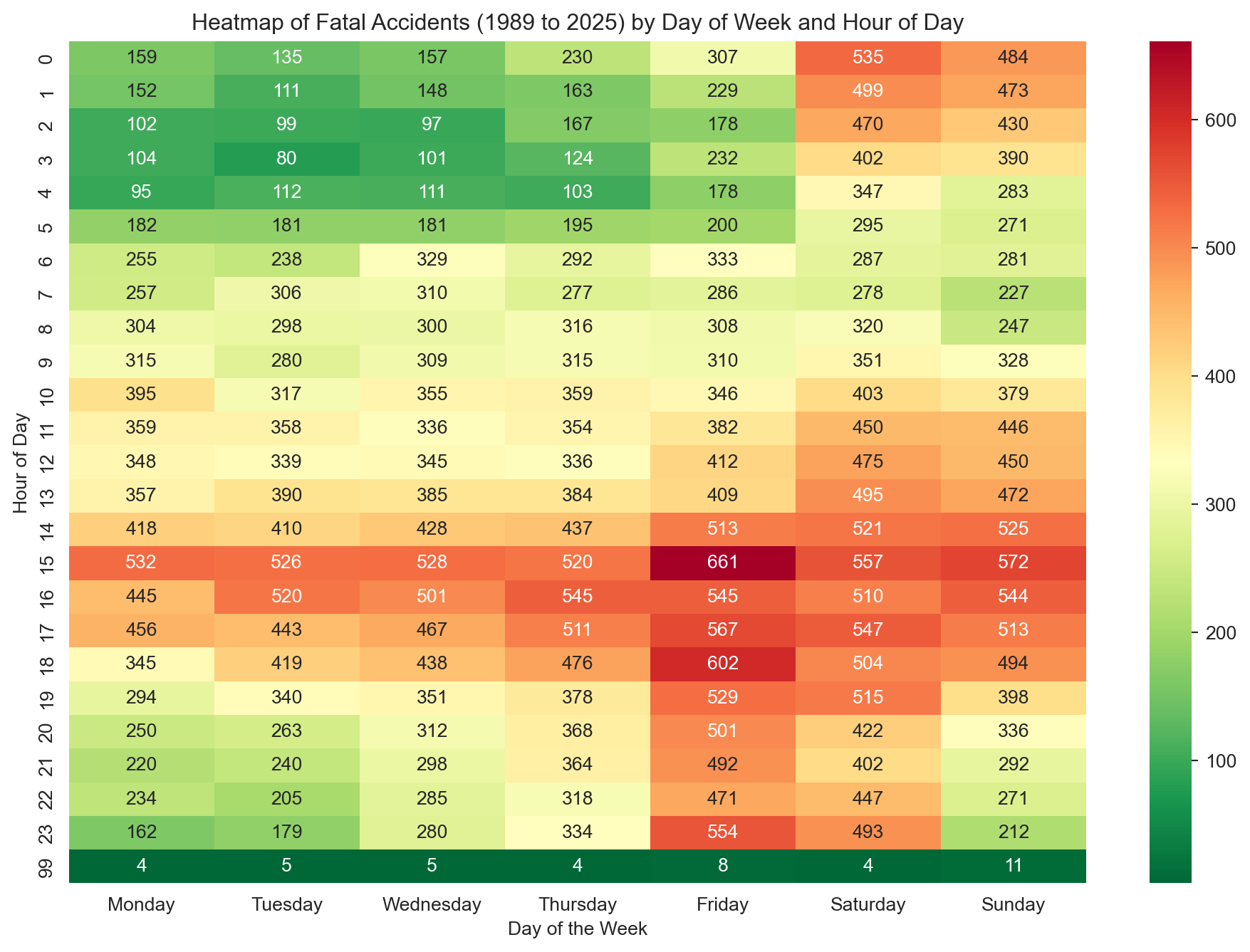
A day-of-week and hour-of-day heatmap makes the pattern much clearer.
Code
# We will create a new data frame for this visualisation because we have to do some manipulation that involves dropping rows. # Creating a new dataframeheatmap_df = df[['Time', 'Dayweek']].copy()# Dropping rows with missing valuesheatmap_df = heatmap_df.dropna(subset=['Time'])# Then we will extract the hour from the time field to make it easier to create a heatmapheatmap_df['Hour'] = heatmap_df['Time'].str.split(':').str[0].astype(int)# Next we need to create a pivot table to convert the data into wide formatpivot_table = pd.pivot_table(heatmap_df, values='Time', index=['Hour'], columns=['Dayweek'], aggfunc='count', fill_value=0)# Finally plotting a heatmapplt.figure(figsize=(12, 8))sns.heatmap(pivot_table[day_order], annot=True, cmap='RdYlGn_r', # Take a colour pallet from https://loading.io/color/feature/RdYlGn-9/ and use _r to flip it so that red is higher and green is lower fmt='g')plt.title(f"Heatmap of Fatal Accidents ({earliest_year} to {latest_year}) by Day of Week and Hour of Day")plt.xlabel('Day of the Week')plt.ylabel('Hour of Day')plt.show()
Friday and Saturday afternoons stand out clearly — the 3pm Friday slot in particular. Late-night weekend hours also see elevated numbers.
Change over time in the number of fatal accidents by year
Code
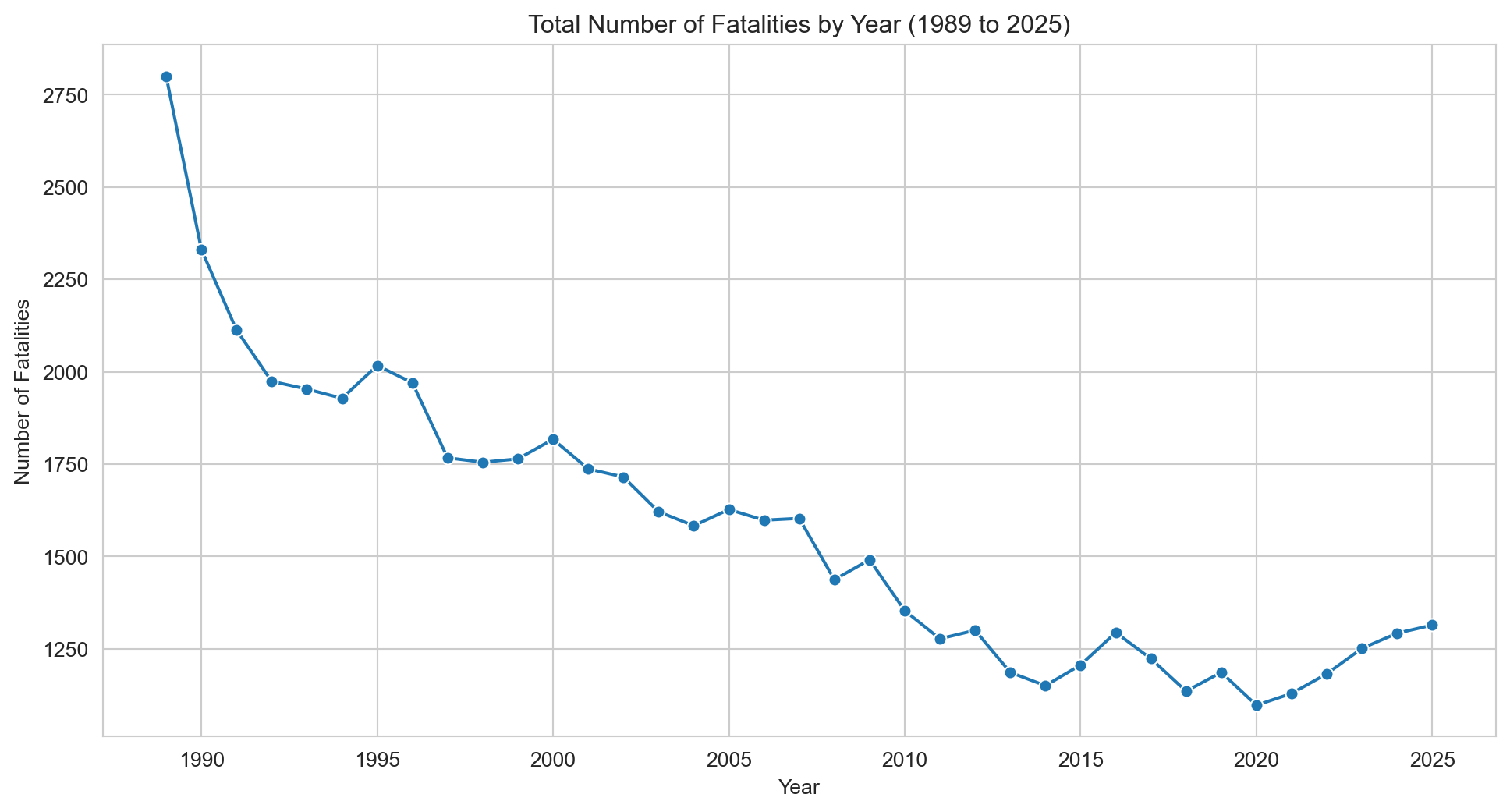
# Creating a line graph of fatalities by yearfatalities_per_year = df.groupby('Year')['Crash ID'].size().reset_index()fatalities_per_year.columns = ['Year', 'Fatalities']# Creating a Line Plotsns.set_style('whitegrid')plt.figure(figsize=(12, 6))sns.lineplot(x='Year', y='Fatalities', data=fatalities_per_year, marker="o")plt.title(f"Total Number of Fatalities by Year ({earliest_year} to {latest_year})")plt.xlabel('Year')plt.ylabel('Number of Fatalities')plt.grid(True)plt.show()
Road fatalities have declined substantially since 1989, but have risen from their historic low of around 1,100 in 2020–21 to levels not seen since 2016. Since Australia’s population has grown considerably over this period, raw counts alone can be misleading — a population-adjusted measure gives a more accurate picture of road safety progress.
Code
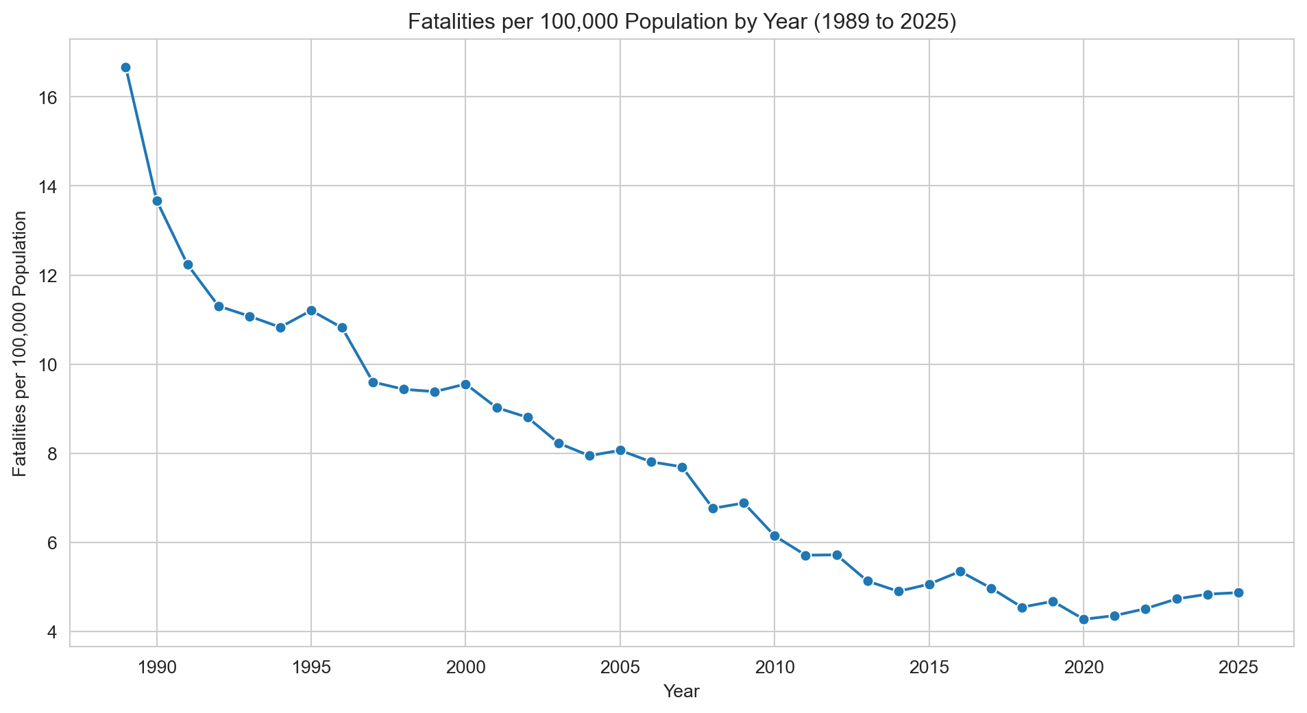
# We find population data for Australia from 1989 to 2021 from the United Nations website: https://population.un.org/dataportal/data/indicators/49/locations/36/start/1989/end/2021/table/pivotbylocation# Using this data we create a dictionary with Year as the index. australian_population_data = {'Year': list(range(1989, 2026)),'Population': [16796588, 17048003, 17271086, 17462504, 17631511, 17805504, 18003000,18211845, 18410250, 18601667, 18800892, 19017963, 19248143, 19475844,19698999, 19925056, 20171731, 20467030, 20830828, 21247873, 21660892,22019168, 22357034, 22729269, 23111782, 23469579, 23820236, 24195701,24590334, 24979230, 25357170, 25670051, 25921089, 26200985, 26451124,26713205, 26974026 ]}# Creating a dataframe from the dictionarypopulation_df = pd.DataFrame(australian_population_data)# Merge the population data with the fatalities datamerged_df = pd.merge(fatalities_per_year, population_df, on='Year', how='inner')# Calculate the number of fatalities per 100,000 peoplemerged_df['Fatalities per 100k'] = (merged_df['Fatalities'] / merged_df['Population']) *100000# Line plot of fatalities per 100,000 peoplesns.set_style('whitegrid')plt.figure(figsize=(12, 6))sns.lineplot(x='Year', y='Fatalities per 100k', data=merged_df, marker="o")plt.title(f"Fatalities per 100,000 Population by Year ({earliest_year} to {latest_year})")plt.xlabel('Year')plt.ylabel('Fatalities per 100,000 Population')plt.grid(True)plt.show()
When adjusted for population growth, the picture is more nuanced. Fatalities per 100,000 people remain only slightly above the pre-pandemic low, reflecting the fact that the recent rise in raw numbers is partly explained by a larger population base. Population-adjusted figures are generally a more meaningful measure of road safety progress, and on that basis the recent increase, while worth monitoring, is considerably less dramatic than the raw numbers suggest.
Fatalities by gender over time
Code
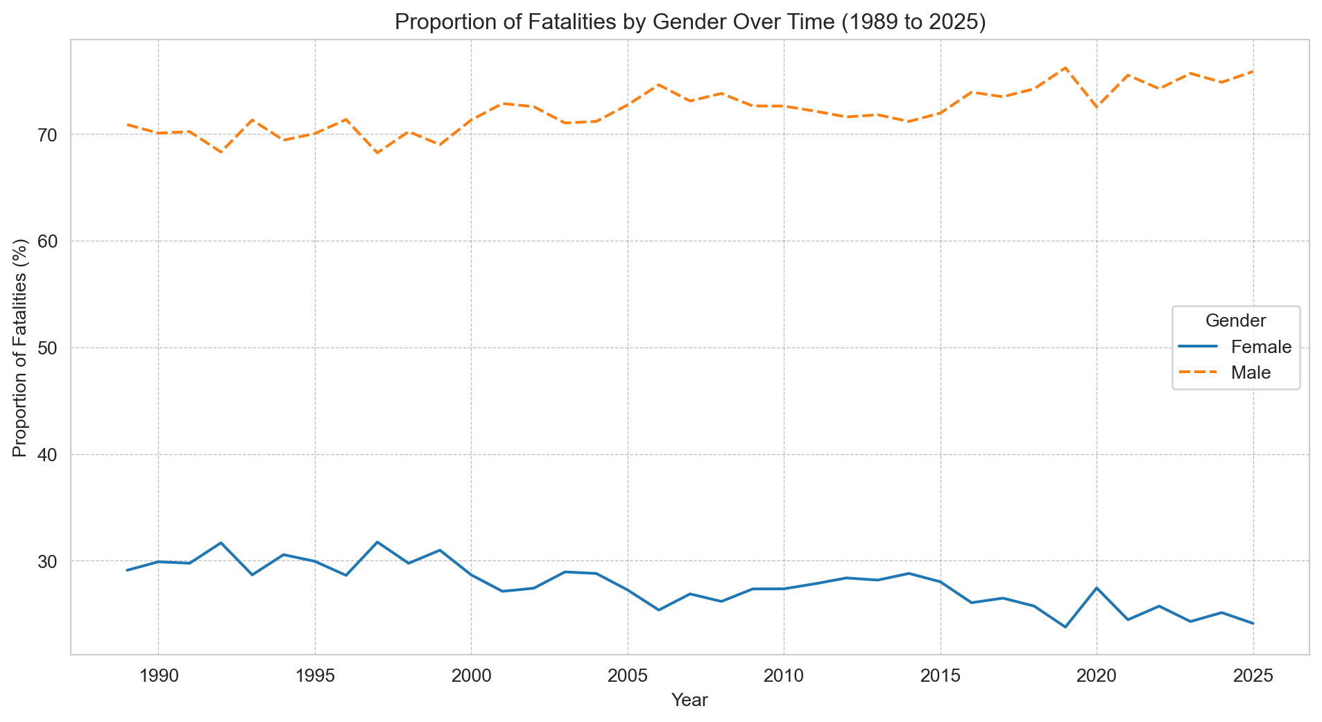
# Grouping the number of fatalities each year by gendergender_fatalities = df.groupby(['Year', 'Gender'])['Crash ID'].size().reset_index(name='Fatalities')# Calculating total fatalities per yeartotal_fatalities_per_year = gender_fatalities.groupby('Year')['Fatalities'].sum().reset_index(name='Total Fatalities')# Merging the dataframes and calculating proportionsgender_fatalities = pd.merge(gender_fatalities, total_fatalities_per_year, on='Year')gender_fatalities['Proportion'] = (gender_fatalities['Fatalities'] / gender_fatalities['Total Fatalities']) *100# Pivoting the data for easier plottinggender_proportions_pivot = gender_fatalities.pivot(index='Year', columns='Gender', values='Proportion')# Plottingsns.set_style('whitegrid')plt.figure(figsize=(12, 6))sns.lineplot(data=gender_proportions_pivot)plt.title(f"Proportion of Fatalities by Gender Over Time ({earliest_year} to {latest_year})")plt.xlabel('Year')plt.ylabel('Proportion of Fatalities (%)')plt.grid(color='grey', linestyle='--', linewidth=0.5, alpha=0.5)plt.legend(title='Gender')plt.show()
The male-to-female ratio has barely shifted since 1989 — this is a persistent structural pattern, not a recent phenomenon.
Fatalities by age group over time
Code
# Plottingsns.set_style('whitegrid')plt.figure(figsize=(12, 6))sns.lineplot(data=age_group_fatalities_pivot, marker="o", linewidth=2.5) # Use the pivot table created earlierplt.title(f"Fatalities Over Time by Age Group ({earliest_year} to {latest_year})")plt.xlabel('Year')plt.ylabel('Number of Fatalities')plt.grid(color='gray', linestyle='--', linewidth=0.5)plt.legend(title='Age Group')plt.show()
Every age group has seen a decline, but the 17–25 cohort stands out — the drop is steeper than any other, likely reflecting graduated licensing reforms introduced across Australian states in the 1990s and 2000s. Around the same time, 40–64 year olds overtook younger drivers as the age group with the highest annual fatality count.
Fatalities by road user type over time
Code
# Grouping data by year and road user type, and counting fatalitiesped_and_cyclist_fatalities = df[df['Road User'].isin(['Pedal cyclist', 'Pedestrian'])]# Group data by Year and Road User, counting all Crash ID occurrencesfatalities_by_year_user = ped_and_cyclist_fatalities.groupby(['Year', 'Road User'])['Crash ID'].count().reset_index(name='Fatalities')# Merge fatalities data with population datafatalities_with_pop = pd.merge(fatalities_by_year_user, population_df, on='Year', how='left')# Calculate fatalities per 100,000 peoplefatalities_with_pop['Fatalities per 100k'] = (fatalities_with_pop['Fatalities'] / fatalities_with_pop['Population']) *100000# Pivot the datasns.set_style('whitegrid')plt.figure(figsize=(12, 6))sns.lineplot(x='Year', y='Fatalities per 100k', data=fatalities_with_pop, hue='Road User', marker="o")plt.title(f"Fatalities per 100,000 Population Over Time by Road User Type ({earliest_year} to {latest_year})")plt.xlabel('Year')plt.ylabel('Fatalities per 100,000 Population')plt.grid(True)sns.despine()plt.tight_layout()plt.show()
Pedestrian fatalities have fallen steadily since 1989. Cyclist deaths have barely moved since the mid-1990s — a gap explored further in the vulnerable road users notebook.
Part 4: Conclusion
This analysis mapped how fatal road crashes in Australia have changed from 1989 to 2025 across people, places, and time.
Key findings include: - A significant overall decline in fatalities, both in absolute terms and per 100,000 population. - The largest reduction occurred among 17–25-year-old drivers, potentially linked to licensing reforms targeting provisional licence holders. - Males consistently account for approximately 70% of road fatalities throughout the observed period. - Fatal accidents are most concentrated between Friday and Sunday, with Friday afternoons posing the highest risk. - New South Wales, Victoria, and Queensland collectively represent over 80% of national road fatalities. - Pedestrian fatalities have decreased over time, while cyclist fatalities have remained relatively stable since the mid-1990s.
Opportunities for Further Research
This dataset covers fatal crashes only. Adding non-fatal injury data would give a fuller view of road harm, not just the most severe outcomes.
It would also be useful to examine injury-to-fatality ratios for pedestrians and cyclists to better understand where safety gains are happening and where they are stalling.