Pedestrian and Cyclist Fatalities: Children Under 16
This sub-analysis looks at fatal crashes involving child pedestrians and cyclists in Australia from 1989 to the present. These groups are especially vulnerable on roads because they have less physical protection and often less traffic awareness than adults.
The notebook focuses on identifying: - Long-term trends in child pedestrian and cyclist fatalities - Temporal and gender-based differences - Key risk periods by month, day, and time
The goal is to highlight patterns that can inform practical safety interventions for children.
1. Key Findings
Fatalities Have Declined: Both pedestrian and cyclist fatalities have steadily decreased since 1989, with more pronounced reductions among pedestrians.
Gender Disparity: Males make up the majority of fatalities in both cohorts, especially among cyclists (87%).
High-Risk Time Windows: Most fatalities occur on weekdays during school commute hours — especially 3–6 pm.
Seasonal Trends: Warmer months (particularly March) see more fatalities, suggesting increased outdoor activity or exposure.
State Patterns: New South Wales consistently reports the highest number of fatalities, even in recent years.
2. Data Cleaning
Data cleaning pipeline is imported from the data_cleaning.py file. The pipeline includes functions to load the data, clean it, and filter it for the analysis.
Code
"""This notebook is fully self-contained and does not depend on the main EDA notebook.The dataset is loaded and cleaned using `full_clean_pipeline()` from `scripts/data_cleaning.py`, which:- Loads raw data from /data/Crash_Data.csv- Cleans missing values and harmonizes variables- Drops incomplete or irrelevant columns- Returns a tidy, ready-to-analyze DataFrame"""# Set the directory for the scriptimport syssys.path.append("../scripts") # Importing necessary librariesimport pandas as pd import numpy as npimport matplotlib.pyplot as pltimport seaborn as snsfrom IPython.display import displayfrom data_cleaning import full_clean_pipelinedf = pd.read_csv("../data/Crash_Data.csv", low_memory=False)df = full_clean_pipeline(df)# Create variable for the earliest and latest years in the dataset to be dynamically displayed in plot titleslatest_year = df['Year'].max()earliest_year = df['Year'].min()print(f"The dataset contains data from {earliest_year} to {latest_year}.")
This section focuses on child pedestrians and cyclists and tracks long-term trends, gender differences, and high-risk time windows (month, day, and hour). The aim is to keep the findings practical and easy to act on.
3.1 Child Pedestrian and Cyclist Fatalities
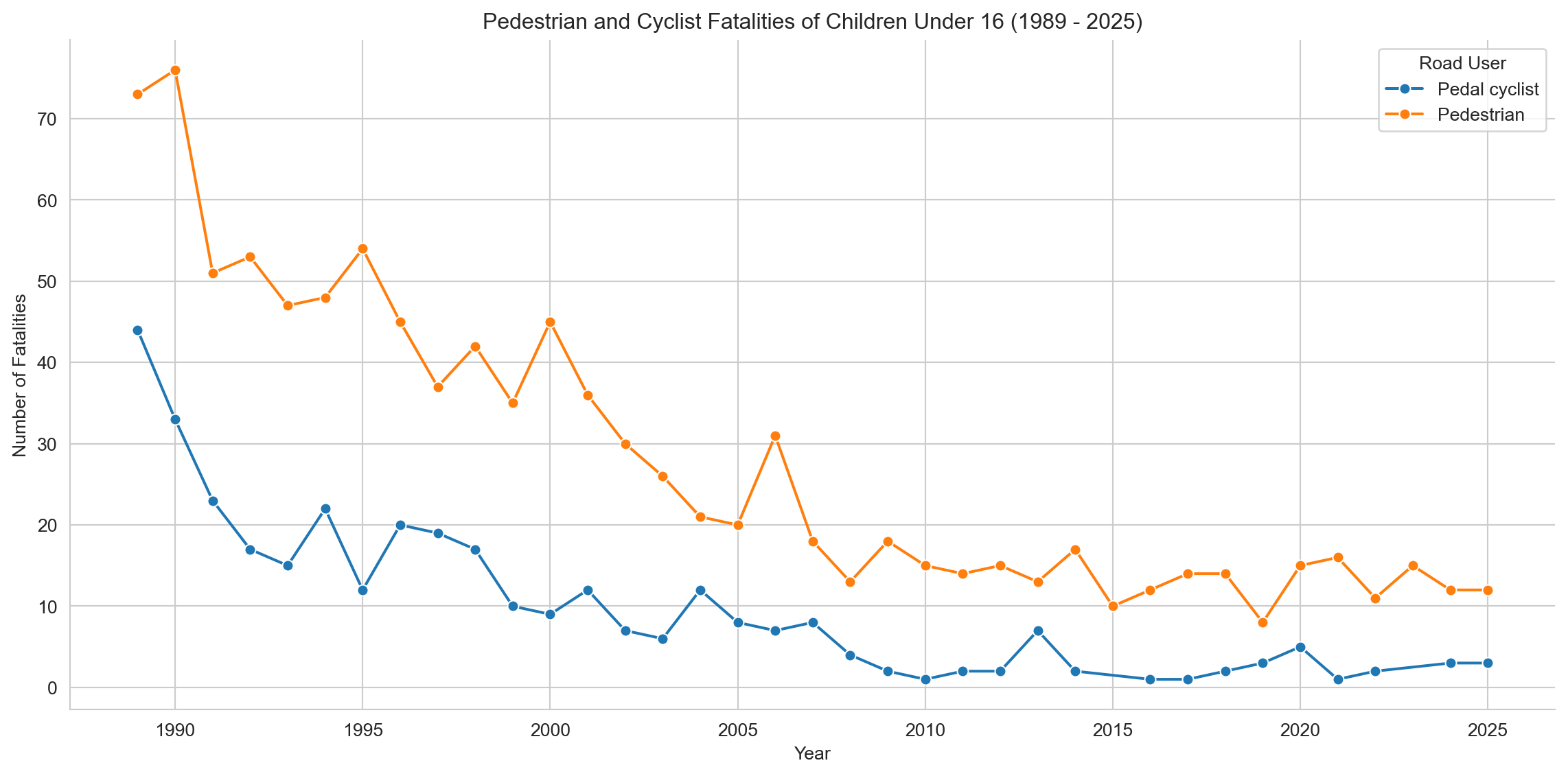
3.1.1 Child Pedestrian and Cyclist Fatalities by Year
Code
# Fatalities for Children Under 16 by Road User Type # Group data by Year and Road User, counting all Crash ID occurrencesfatalities_by_year_user_children = child_ped_cyclist_fatalities.groupby(['Year', 'Road User'])['Crash ID'].count().reset_index(name='Fatalities') # Changed variable name# Plotting raw numbers of Fatalities for Children Under 16sns.set_style('whitegrid')plt.figure(figsize=(12, 6))sns.lineplot(x='Year', y='Fatalities', data=fatalities_by_year_user_children, hue='Road User', marker="o")plt.title(f'Pedestrian and Cyclist Fatalities of Children Under 16 ({earliest_year} - {latest_year})')plt.xlabel('Year')plt.ylabel('Number of Fatalities')plt.grid(True)sns.despine()plt.tight_layout()plt.show()
Both groups show a substantial reduction in fatalities over time, particularly during the early 1990s. Pedestrian fatalities consistently outnumber cyclist fatalities by a wide margin, though both decline sharply from 1989 to the early 2000s before plateauing. Notably, pedestrian deaths fall from over 70 in 1989 to fewer than 20 per year by 2010, while cyclist fatalities drop from over 40 to fewer than 10 in the same period.
The rate of decline appears to slow post-2005, suggesting a possible floor effect or the limits of existing road safety interventions. This plateau may reflect the need for new strategies targeting high-risk environments, particularly in urban pedestrian zones.
Code
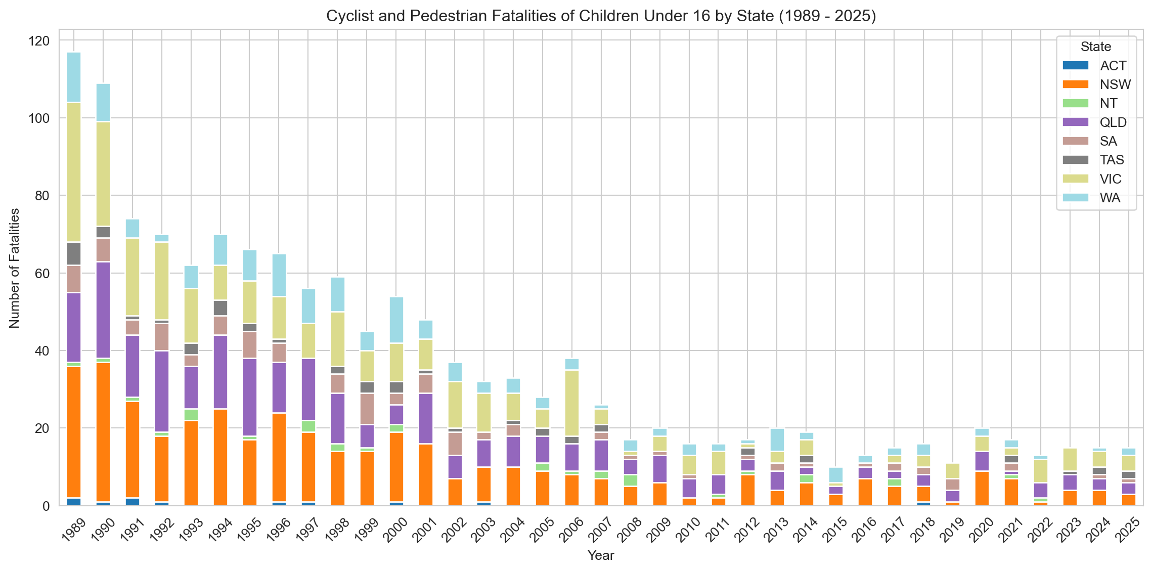
# Group data by Year and State, counting all Crash ID occurrencesfatalities_by_year_state = child_ped_cyclist_fatalities.groupby(['Year', 'State'])['Crash ID'].count().reset_index(name='Fatalities')# Create a pivot table for the stacked bar chartpivot_fatalities_state = fatalities_by_year_state.pivot(index='Year', columns='State', values='Fatalities').fillna(0)# Sort the index to make sure years are in orderpivot_fatalities_state = pivot_fatalities_state.sort_index()# Plotting raw numbers of pedal cyclist and pedestrian fatalities for children under 16 by state (stacked bar chart)sns.set_style('whitegrid')pivot_fatalities_state.plot(kind='bar', stacked=True, figsize=(12, 6), cmap='tab20')plt.title(f'Cyclist and Pedestrian Fatalities of Children Under 16 by State ({earliest_year} - {latest_year})')plt.xlabel('Year')plt.ylabel('Number of Fatalities')plt.legend(title='State')plt.xticks(rotation=45)plt.tight_layout()plt.show()
Fatalities have declined across all jurisdictions over the past three decades, with the steepest reductions occurring in the early 1990s. New South Wales consistently recorded the highest number of child fatalities, followed by Victoria and Queensland. From around 2010 onward, most states reached relatively low and stable fatality counts, with smaller jurisdictions such as the ACT, Tasmania, and the Northern Territory reporting only isolated deaths in some years.
The overall downward trend suggests widespread improvements in road safety and child protection, though persistent differences between larger and smaller states may reflect underlying variations in population size, infrastructure, and road use exposure.
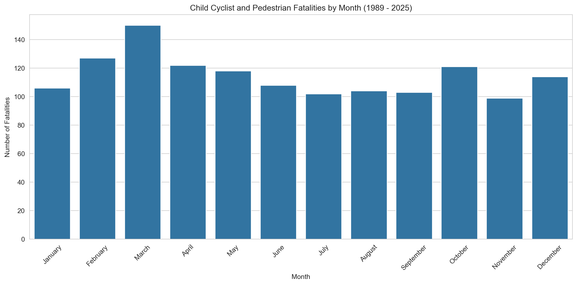
3.1.2 Child Pedestrian and Cyclist Fatalities by Month
Code
# Use the pre-defined DataFrame directlymonth_counts_df = child_ped_cyclist_fatalities.copy() # Use copy only if adding column modifies original view, safer practicemonth_counts_df['Month Name'] = month_counts_df['Month'].map(month_names)# Calculate the number of accidents by monthmonth_counts = month_counts_df['Month Name'].value_counts().reset_index()month_counts.columns = ['Month', 'Fatalities']month_counts['Month'] = pd.Categorical(month_counts['Month'], categories=month_order, ordered=True) # Uses global month_ordermonth_counts = month_counts.sort_values('Month')# Plotting a bar plot for monthly breakdownplt.figure(figsize=(12, 6))sns.barplot(x='Month', y='Fatalities', data=month_counts, dodge=False)plt.title(f'Child Cyclist and Pedestrian Fatalities by Month ({earliest_year} - {latest_year})')plt.xlabel('Month')plt.ylabel('Number of Fatalities')plt.xticks(rotation=45)plt.tight_layout()plt.show()# Notes to self:# - March consistently shows the highest fatalities. Hypothesis: post-holiday period rush, school resumes, weather still warm.# - Could explore whether public holidays or daylight changes contribute to spikes.# - Consider overlaying school term calendars for more precision - using matplotlib
March records the highest number of fatalities, followed by February and April, suggesting a seasonal pattern linked to school terms and active travel. In contrast, July and November show the lowest fatality counts, coinciding with mid-year and end-of-year school holidays when children may be less exposed to traffic during commutes.
These patterns highlight the increased risk during school periods, particularly at the beginning of the academic year, and reinforce the need for targeted road safety campaigns and infrastructure improvements near schools and common travel routes.
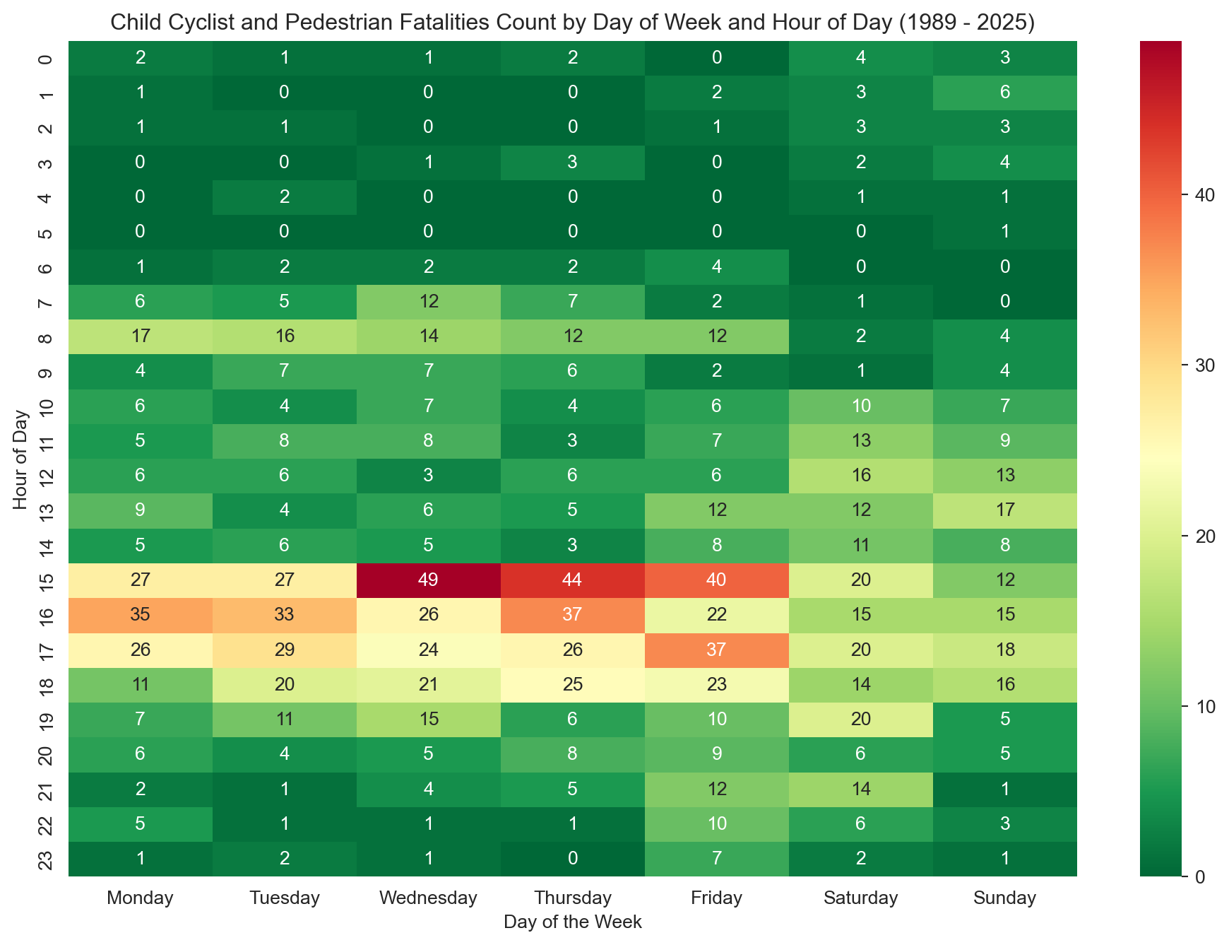
3.1.3 Child Pedestrian and Cyclist Fatalities by Day of Week and Time of Day
Code
# Operate on a sliceheatmap_df = child_ped_cyclist_fatalities[['Time', 'Dayweek']]# Dropping rows with missing values in 'Time' - creates a new DataFrameheatmap_df = heatmap_df.dropna(subset=['Time']).copy() # Add copy here after dropna to avoid SettingWithCopyWarning# Extracting the hour from the time fieldheatmap_df['Hour'] = heatmap_df['Time'].str.split(':').str[0].astype(int)# Creating a pivot table to convert the data into wide formatpivot_table = pd.pivot_table(heatmap_df, values='Time', index=['Hour'], columns=['Dayweek'], aggfunc='count', fill_value=0)# Reindex for consistency (optional but good practice)pivot_table = pivot_table.reindex(range(24), fill_value=0)pivot_table = pivot_table.reindex(columns=day_order, fill_value=0)# Plotting a heatmapplt.figure(figsize=(12, 8))sns.heatmap(pivot_table, # Use reindexed table annot=True, cmap='RdYlGn_r', # Take a colour palette from https://loading.io/color/feature/RdYlGn-9/ and use _r to flip it so that red is higher and green is lower fmt='g')plt.title(f'Child Cyclist and Pedestrian Fatalities Count by Day of Week and Hour of Day ({earliest_year} - {latest_year})')plt.xlabel('Day of the Week')plt.ylabel('Hour of Day')plt.show()# Notes to self:# - Strong peaks at 8–9 AM and 3–5 PM on weekdays likely align with school commute times.# - Lighter activity on weekends, but Saturdays still have a mild peak in the afternoon.# - Might be worth exploring how school safety campaigns or pedestrian crossings have changed over time.# - Potential: Animate the heatmap across decades to see if patterns shift.
This heatmap shows when child pedestrian and cyclist fatalities (under 16) most commonly occur, broken down by hour of day and day of week (1989–2025). Areas of darker red indicate higher fatality counts, with the most dangerous time windows clearly concentrated on weekday afternoons. The highest peak is seen around 3 PM on Wednesdays, likely corresponding to school dismissal times. A smaller morning peak appears between 8–9 AM, reflecting school commute patterns.
On weekends, fatalities are lower overall and spread more evenly throughout the day, with a minor rise around 3 PM on Saturdays. These patterns highlight the need for targeted road safety measures during school travel hours, particularly in the afternoon when children may be less supervised and traffic volume is high.
3.1.4 Child Pedestrian and Cyclist Fatalities by Gender
Code
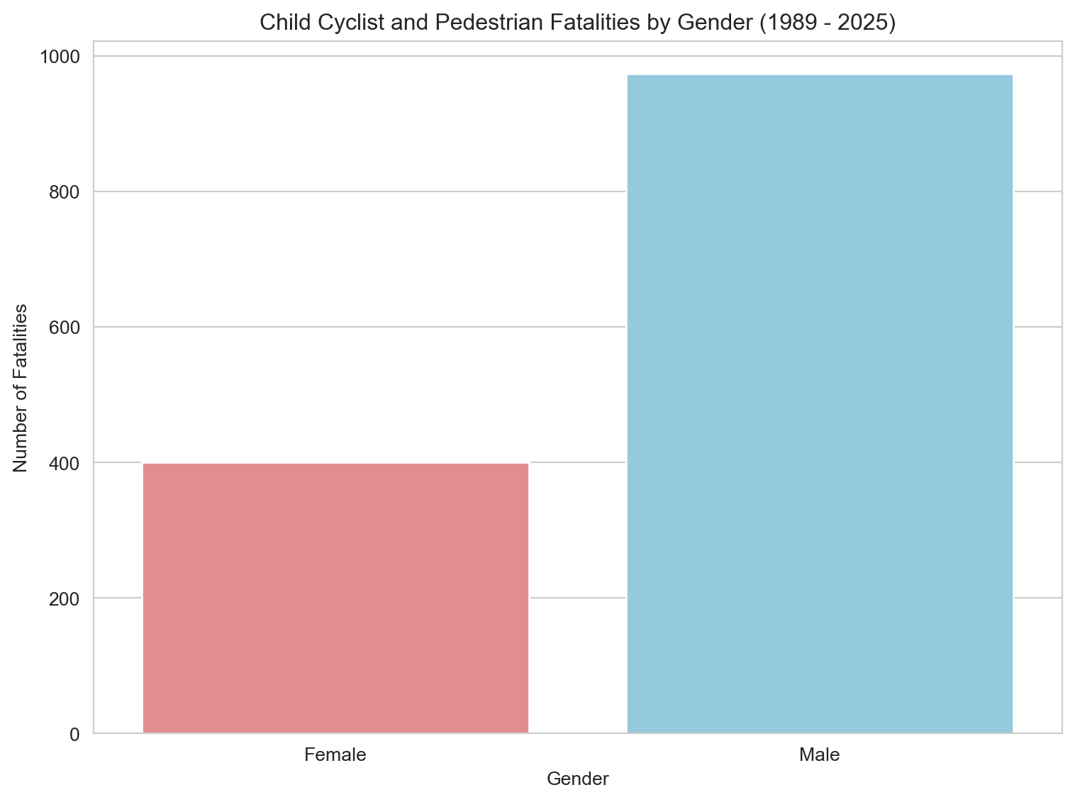
ped_cyclist_gender_fatalities = child_ped_cyclist_fatalities.dropna(subset=['Gender'])# Group data by Gender, counting all Crash ID occurrencesped_cyclist_gender_count = ped_cyclist_gender_fatalities.groupby('Gender')['Crash ID'].count().reset_index(name='Fatalities')# Plotting a bar plot for Gender breakdown of combined pedestrian and cyclist fatalitiesplt.figure(figsize=(8, 6))sns.barplot(x='Gender', y='Fatalities', data=ped_cyclist_gender_count, hue='Gender', palette=custom_palette, dodge=False, legend=False)plt.title(f'Child Cyclist and Pedestrian Fatalities by Gender ({earliest_year} - {latest_year})') plt.xlabel('Gender')plt.ylabel('Number of Fatalities')plt.tight_layout()plt.show()# Calculate and print the percentageped_cyclist_gender_count['Percentage'] = (ped_cyclist_gender_count['Fatalities'] / ped_cyclist_gender_count['Fatalities'].sum()) *100print(ped_cyclist_gender_count[['Gender', 'Percentage']])# Notes to self:# - Significant male overrepresentation (71%) — this echoes broader patterns in injury epidemiology.# - Consider referencing behavioural studies on risk-taking in boys vs girls.# - Could be interesting to stratify by pedestrian vs cyclist — are boys more likely in one group?
   Gender  Percentage
0  Female   29.112082
1    Male   70.887918
Males account for 71% of fatalities, while females make up 29% — a ratio that aligns with global trends in child injury and trauma literature. Boys are consistently overrepresented in road trauma statistics, often attributed to differences in risk-taking behaviour, mobility patterns, and supervision levels. These disparities suggest the need for gender-sensitive road safety education and interventions, particularly those that address behavioural risk factors among young boys.
3.2 Child Pedestrian Fatalities
In this section, we examine child pedestrian fatalities independently to identify risk patterns unique to this group. Isolating these incidents enables more precise policy recommendations around urban planning, traffic calming, and school zone safety.
3.2.1 Child Pedestrian Fatalities by Year
Code
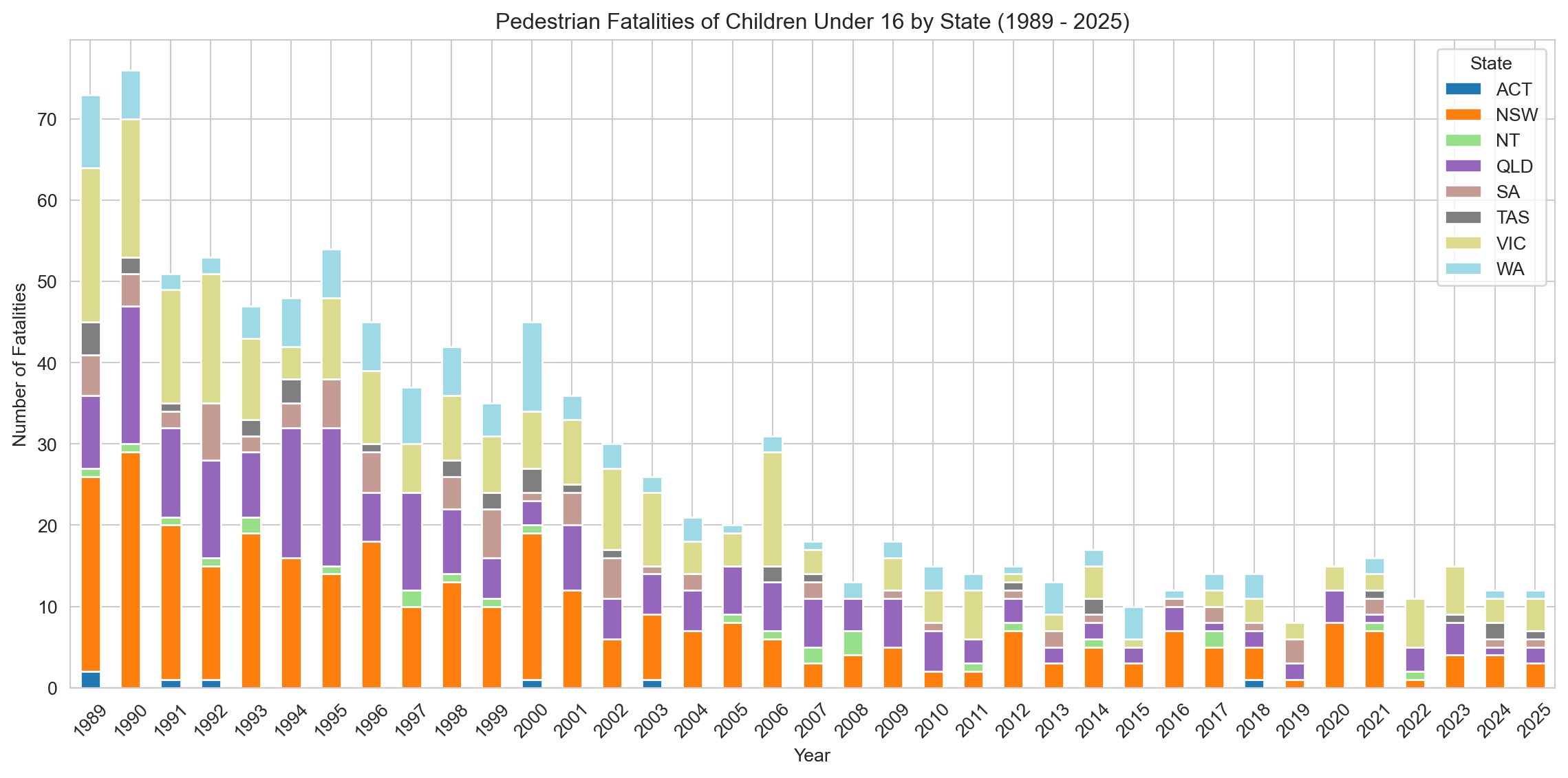
fatalities_by_year_state = pedestrian_children.groupby(['Year', 'State'])['Crash ID'].count().reset_index(name='Fatalities')# Create a DataFrame with all years in the desired range (DYNAMIC)all_years = pd.DataFrame({'Year': np.arange(earliest_year, latest_year +1)})# Merge this with the fatalities_by_year_state DataFrame to include all yearsall_years_fatalities = pd.merge(all_years, fatalities_by_year_state, on='Year', how='left')# Fill NaN States potentially introduced by left merge before pivoting (though less likely here)# Fill NaN Fatalities with 0all_years_fatalities['Fatalities'] = all_years_fatalities['Fatalities'].fillna(0)# Ensure State column doesn't have NaNs if a year had 0 fatalities across all states (edge case)# all_years_fatalities['State'] = all_years_fatalities['State'].fillna('Unknown') # Or handle differently if needed# Create a pivot table for the stacked bar chart# Need to handle potential multiple states per year after merge if not grouping firstpivot_fatalities_state = pd.pivot_table(all_years_fatalities, index='Year', columns='State', values='Fatalities', fill_value=0)# Sort the index to make sure years are in orderpivot_fatalities_state = pivot_fatalities_state.sort_index()# Plotting raw numbers of pedestrian fatalities for children under 16 by state (stacked bar chart)sns.set_style('whitegrid')pivot_fatalities_state.plot(kind='bar', stacked=True, figsize=(12, 6), cmap='tab20')plt.title(f'Pedestrian Fatalities of Children Under 16 by State ({earliest_year} - {latest_year})')plt.xlabel('Year')plt.ylabel('Number of Fatalities')plt.legend(title='State')plt.xticks(rotation=45)plt.tight_layout()plt.show()# Notes to self:# - Post-2016, NSW appears to spike in several years despite overall low fatality counts.# - Check if these are isolated incidents or part of a broader trend.# - Could normalise by child population in each state to see per capita risk.
This stacked bar chart shows the annual number of child pedestrian fatalities by state and territory from 1989 to 2025.
However, because numbers in the later years are low, small fluctuations can appear large in relative terms, and should be interpreted cautiously. The continued presence of fatalities in NSW during this period may warrant further investigation into population density, urban traffic exposure, or pedestrian safety infrastructure.
3.2.2 Child Pedestrian Fatalities by Month
Code
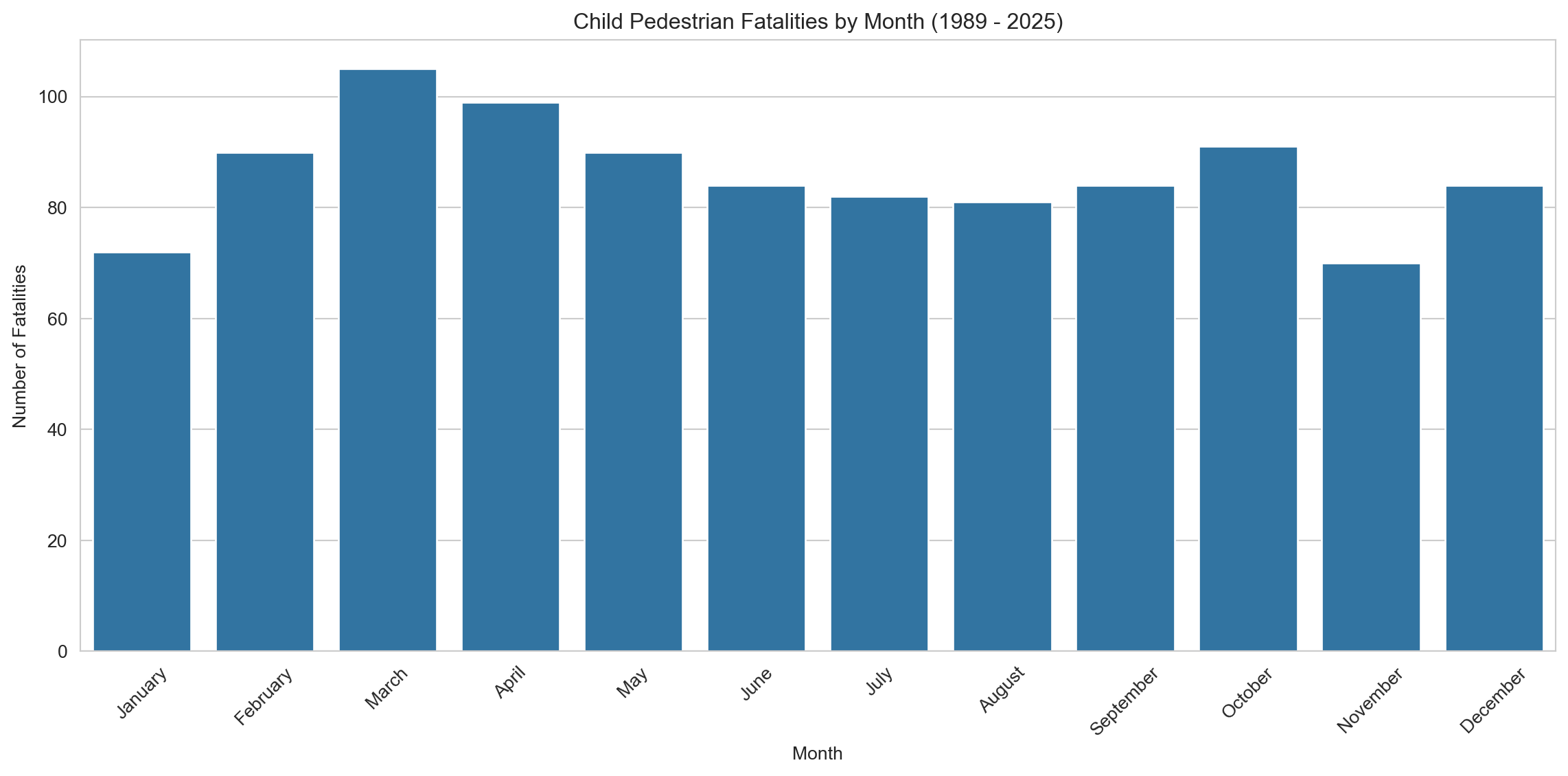
# Use the pre-defined DataFrame for pedestrian children directlymonth_counts_ped_df = pedestrian_children.copy() # Use copy only if adding column modifies original viewmonth_counts_ped_df['Month Name'] = month_counts_ped_df['Month'].map(month_names) # Uses global month_names# Calculate the number of fatalities by monthmonth_counts_pedestrian = month_counts_ped_df['Month Name'].value_counts().reset_index()month_counts_pedestrian.columns = ['Month', 'Fatalities']# Sort the months in order using the existing month_order listmonth_counts_pedestrian['Month'] = pd.Categorical(month_counts_pedestrian['Month'], categories=month_order, ordered=True) # Uses global month_ordermonth_counts_pedestrian = month_counts_pedestrian.sort_values('Month')# Plotting a bar plot for monthly breakdown of pedestrian fatalitiesplt.figure(figsize=(12, 6))sns.barplot(x='Month', y='Fatalities', data=month_counts_pedestrian, dodge=False, legend=False)plt.title(f'Child Pedestrian Fatalities by Month ({earliest_year} - {latest_year})')plt.xlabel('Month')plt.ylabel('Number of Fatalities')plt.xticks(rotation=45)plt.tight_layout()plt.show()# Notes to self:# - Similar pattern to combined cohort — school months (esp. March/April) have higher fatality counts.# - Slight dip during winter (June–August), potentially due to lower pedestrian activity or shorter days.# - November dip is interesting — worth checking if linked to school exams or decreased mobility.# - Future idea: plot weather data overlays or correlate with pedestrian traffic density.
This bar chart displays child pedestrian fatalities by month from 1989 to 2025. The distribution reveals a seasonal pattern, with higher fatalities in school-term months such as March and April, and a modest dip during mid-year winter months like June and July. March stands out as the peak month for fatalities, which may coincide with the return to school routines, busier traffic, and possibly less daylight in early mornings.
In contrast, November shows the lowest fatality count, possibly reflecting both end-of-year fatigue in reporting or reduced outdoor activity due to rising temperatures and school year winding down.
3.2.3 Child Pedestrian Fatalities by Day of Week and Time of Day
Code
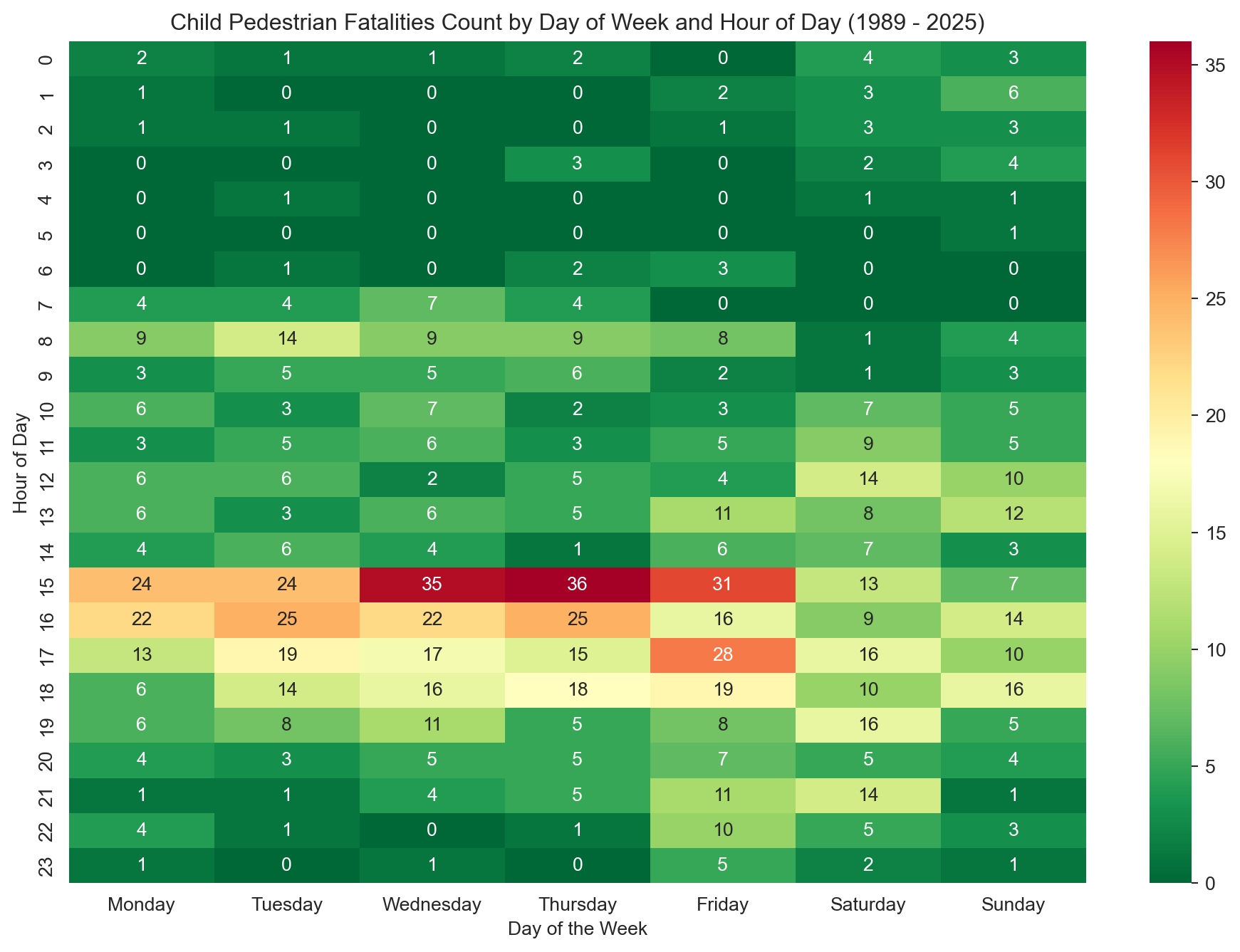
# Create a slice of the pedestrian_children DataFrame with relevant columnsheatmap_df_pedestrian = pedestrian_children[['Time', 'Dayweek']]# Dropping rows with missing values in 'Time' - creates a new DataFrameheatmap_df_pedestrian = heatmap_df_pedestrian.dropna(subset=['Time']).copy() # Add copy here# Extracting the hour from the time fieldheatmap_df_pedestrian['Hour'] = heatmap_df_pedestrian['Time'].str.split(':').str[0].astype(int)# Creating a pivot table for pedestrian fatalitiespivot_table_pedestrian = pd.pivot_table(heatmap_df_pedestrian, values='Time', index=['Hour'], columns=['Dayweek'], aggfunc='count', fill_value=0)# Reindex the pivot table to include all hours from 0 to 23, filling missing hours with 0pivot_table_pedestrian = pivot_table_pedestrian.reindex(range(24), fill_value=0)# Use the existing day_order list to ensure correct column orderpivot_table_pedestrian = pivot_table_pedestrian.reindex(columns=day_order, fill_value=0)# Plotting a heatmap for pedestrian fatalitiesplt.figure(figsize=(12, 8))sns.heatmap(pivot_table_pedestrian, annot=True, cmap='RdYlGn_r', # Using the same reversed Red-Yellow-Green colormap fmt='g') # Format annotation as general numberplt.title(f'Child Pedestrian Fatalities Count by Day of Week and Hour of Day ({earliest_year} - {latest_year})')plt.xlabel('Day of the Week')plt.ylabel('Hour of Day')plt.show()# Future enhancement:# - Animate or facet the heatmap by month to explore seasonality more clearly.# - Overlay or bin hours relative to local sunrise/sunset times for each state — this would allow analysis of fatalities occurring in low-light vs daylight.# - Could investigate whether higher fatality counts correlate with low-light hours in winter months, supporting visibility as a risk factor.# - If sunrise/sunset data proves too fiddly, approximate “daylight” vs “dark” hours by state/season.# - Add weather overlays (rainy vs clear days) if data is accessible — might show interesting visibility or road condition effects.
This heatmap illustrates the distribution of child pedestrian fatalities by hour of day and day of week from 1989 to 2025. The most prominent peaks occur on weekday afternoons, particularly around 3–5 PM, coinciding with typical school dismissal times. Notably, Wednesdays and Thursdays at 3–4 PM exhibit the highest fatality counts, suggesting recurring risk windows in the midweek. Weekend patterns are less pronounced but show modest activity in the late afternoons, particularly on Saturdays. Early morning and late evening hours show comparatively lower risk.
3.2.4 Child Pedestrian Fatalities by Gender
Code
pedestrian_gender_fatalities = pedestrian_children.dropna(subset=['Gender'])# Group data by Gender, counting all Crash ID occurrencespedestrian_gender_count = pedestrian_gender_fatalities.groupby('Gender')['Crash ID'].count().reset_index(name='Fatalities')# Plotting a bar plot for Gender breakdown of pedestrian fatalitiesplt.figure(figsize=(8, 6))sns.barplot(x='Gender', y='Fatalities', data=pedestrian_gender_count, hue='Gender', palette=custom_palette, dodge=False, legend=False)plt.title(f'Child Pedestrian Fatalities by Gender ({earliest_year} - {latest_year})') plt.xlabel('Gender')plt.ylabel('Number of Fatalities')plt.tight_layout()plt.show()# Calculate and print the percentagepedestrian_gender_count['Percentage'] = (pedestrian_gender_count['Fatalities'] / pedestrian_gender_count['Fatalities'].sum()) *100print(pedestrian_gender_count[['Gender', 'Percentage']])
   Gender  Percentage
0  Female   34.399225
1    Male   65.600775
This bar chart shows the distribution of child pedestrian fatalities by gender from 1989 to 2025. Males accounted for 66% of all fatalities, while females made up 34%. Although the disparity is notable, it’s less pronounced than in the combined cyclist + pedestrian cohort, suggesting that male overrepresentation is particularly elevated among cyclists — a trend explored later in this report.
3.3 Child Cyclist Fatalities
This section explores fatal incidents involving child cyclists, examining trends over time, by location, and demographic patterns to identify risk factors unique to this vulnerable road user group.
3.3.1 Child Cyclist Fatalities by Year
Code
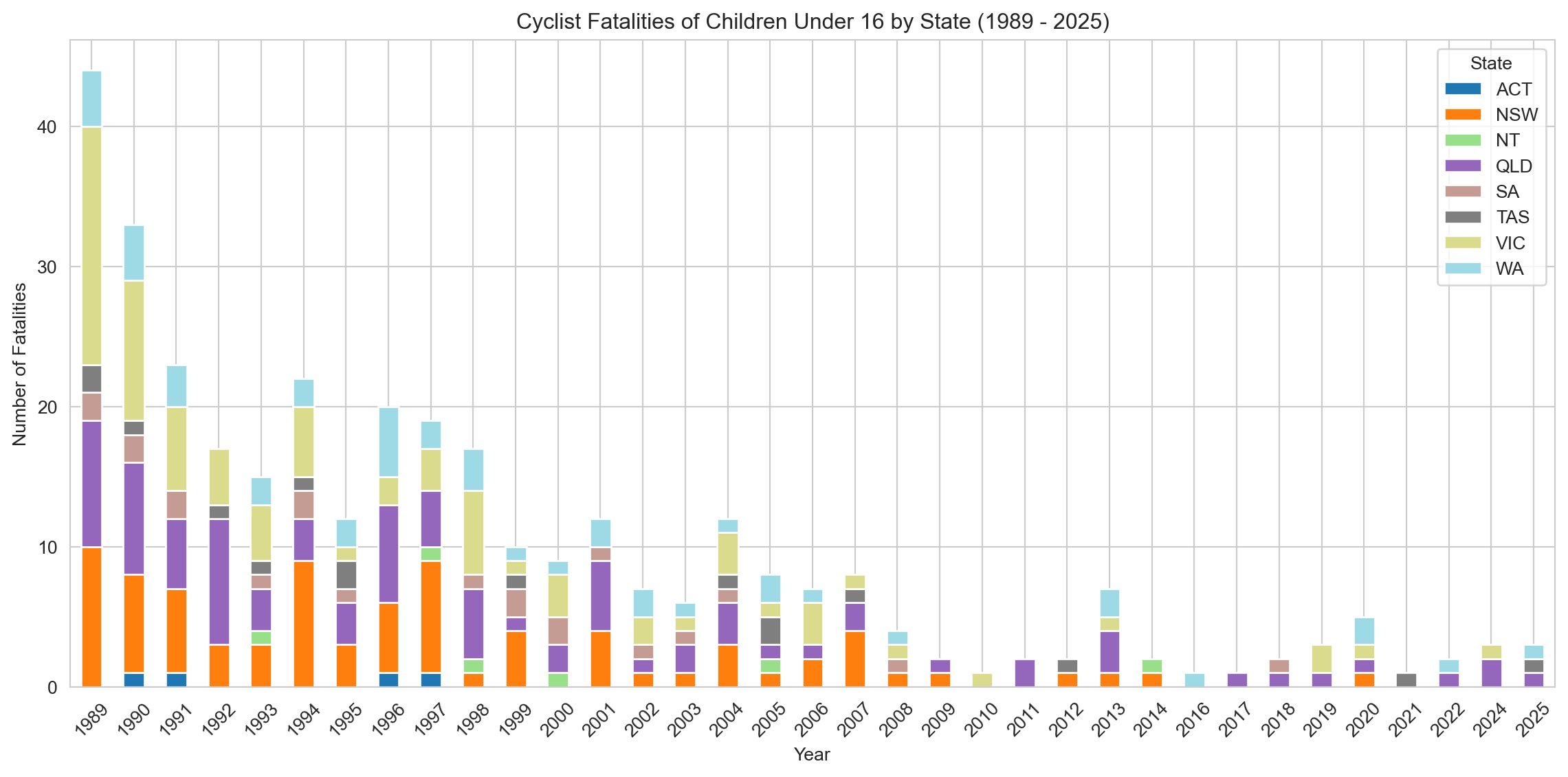
fatalities_by_year_state = cyclist_children.groupby(['Year', 'State'])['Crash ID'].count().reset_index(name='Fatalities')# Create a DataFrame with all years in the desired range (DYNAMIC)all_years = pd.DataFrame({'Year': np.arange(earliest_year, latest_year +1)})# Merge this with the fatalities_by_year_state DataFrame to include all yearsall_years_fatalities = pd.merge(all_years, fatalities_by_year_state, on='Year', how='left')all_years_fatalities['Fatalities'] = all_years_fatalities['Fatalities'].fillna(0)# Create a pivot table for the stacked bar chartpivot_fatalities_state = pd.pivot_table(all_years_fatalities, index='Year', columns='State', values='Fatalities', fill_value=0)# Sort the index to make sure years are in orderpivot_fatalities_state = pivot_fatalities_state.sort_index()sns.set_style('whitegrid')pivot_fatalities_state.plot(kind='bar', stacked=True, figsize=(12, 6), cmap='tab20')plt.title(f'Cyclist Fatalities of Children Under 16 by State ({earliest_year} - {latest_year})')plt.xlabel('Year')plt.ylabel('Number of Fatalities')plt.legend(title='State')plt.xticks(rotation=45)plt.tight_layout()plt.show()# Notes to self:# - Check ABS or transport usage datasets for trends in school transport modes over the same period (1989–2021).# - If cycling to school has dropped, consider citing behavioural/demographic shifts (e.g. rise in car drop-offs, urban sprawl).# - Add an annotation or footnote on the chart pointing out near-zero years post-2010—reinforces rarity of these events.# - Explore splitting the graph by urban vs rural (if data allows) to investigate regional patterns in child cyclist fatalities.# - Optional: Create a faceted version (small multiples) to better visualise each state's trend individually.
This stacked bar chart shows fatal cyclist incidents involving children under 16 across Australian states from 1989 to 2025. There is a clear and sustained decline in fatalities across all jurisdictions over time. While New South Wales, Victoria, and Queensland consistently report the highest counts, the absolute numbers in recent years are very low—often in the single digits. This downward trend may not solely reflect safer road conditions but could also suggest a shift away from cycling as a common mode of transport for children, particularly for school commutes.
3.3.2 Child Cyclist Fatalities by Month
Code
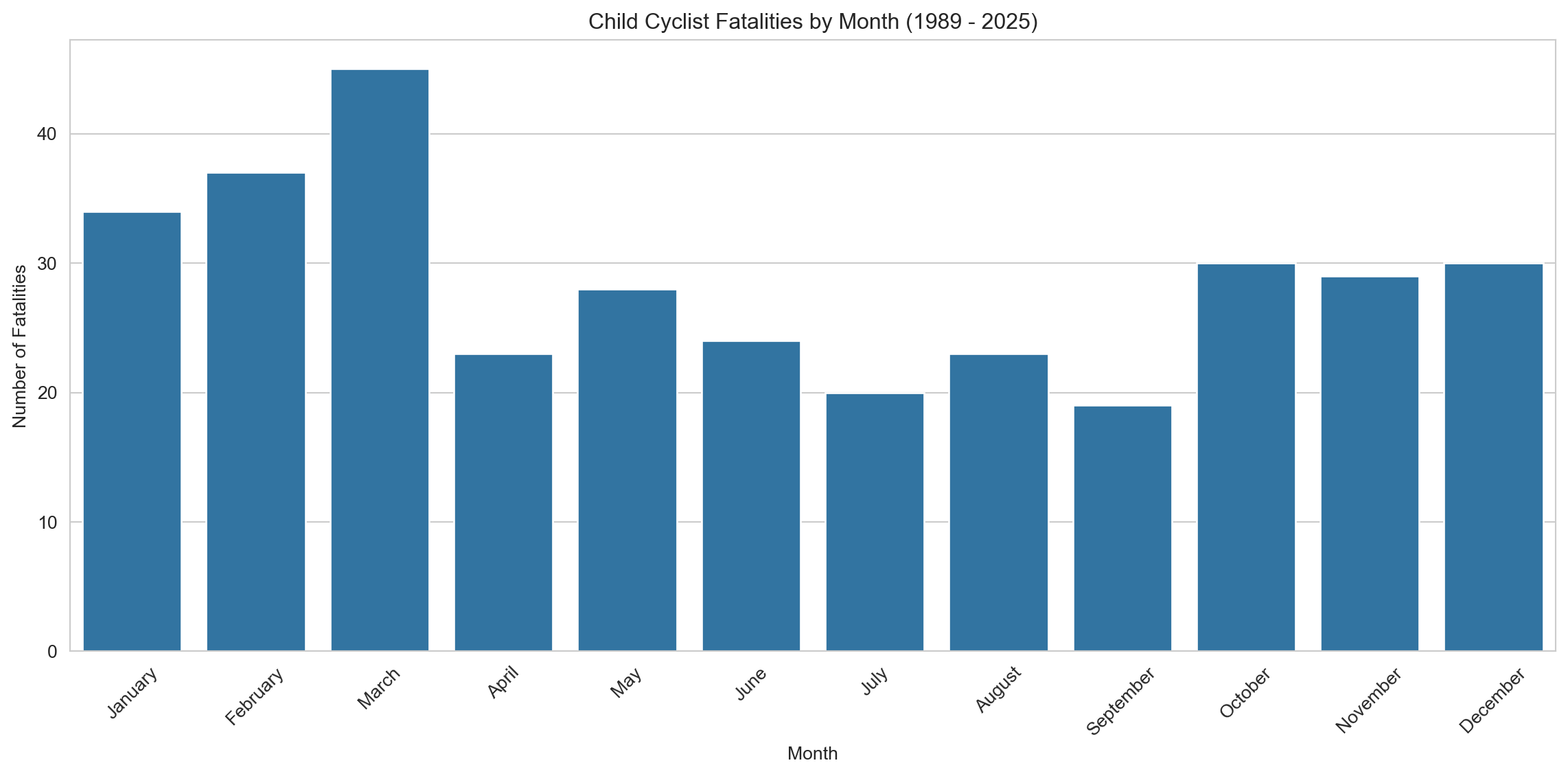
month_counts_cyc_df = cyclist_children.copy() # Use copy only if adding column modifies original view# Map the month numbers to month namesmonth_counts_cyc_df['Month Name'] = month_counts_cyc_df['Month'].map(month_names)# Calculate the number of accidents by monthmonth_counts = month_counts_cyc_df['Month Name'].value_counts().reset_index()month_counts.columns = ['Month', 'Fatalities']month_counts['Month'] = pd.Categorical(month_counts['Month'], categories=month_order, ordered=True)month_counts = month_counts.sort_values('Month')# Plotting a bar plot for monthly breakdownplt.figure(figsize=(12, 6))sns.barplot(x='Month', y='Fatalities', data=month_counts, dodge=False, legend=False)plt.title(f'Child Cyclist Fatalities by Month ({earliest_year} - {latest_year})') plt.xlabel('Month')plt.ylabel('Number of Fatalities')plt.xticks(rotation=45)plt.tight_layout()plt.show()# Notes to self:# - Consider overlaying average national temperature or daylight hours to reinforce seasonal interpretation.# - If possible, add school holiday annotations (April, July, December/January) — may explain dips and spikes.# - Compare to weekday/weekend ratios in cyclist fatalities to explore recreational vs commute-related patterns.# - Optional: Animate with year or cumulative line to show decline across decades alongside seasonality.# - Long-term idea: Examine school policies on cycling (e.g. infrastructure, encouragement) over time for context.
This bar chart illustrates child cyclist fatalities by month from 1989 to 2025. A distinct seasonal pattern emerges, with higher fatalities during warmer months — particularly March, February, and January — and a sharp decline during the colder months of June through September. This suggests that child cycling activity may be strongly influenced by seasonal weather, with reduced exposure to road environments in winter correlating with fewer fatalities.
3.3.3 Child Cyclist Fatalities by Day of Week and Time of Day
Code
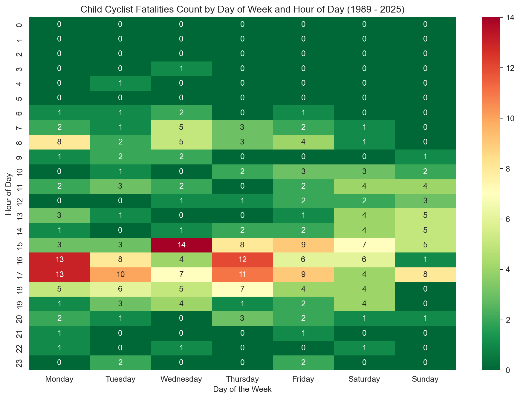
heatmap_df_cyc = cyclist_children[['Time', 'Dayweek']]# Dropping rows with missing values in 'Time'heatmap_df_cyc = heatmap_df_cyc.dropna(subset=['Time']).copy() # Add copy here# Extracting the hour from the time fieldheatmap_df_cyc['Hour'] = heatmap_df_cyc['Time'].str.split(':').str[0].astype(int)# Creating a pivot table to convert the data into wide formatpivot_table_cyc = pd.pivot_table(heatmap_df_cyc, values='Time', index=['Hour'], columns=['Dayweek'], aggfunc='count', fill_value=0)# Reindex for consistencypivot_table_cyc = pivot_table_cyc.reindex(range(24), fill_value=0)pivot_table_cyc = pivot_table_cyc.reindex(columns=day_order, fill_value=0)# Plotting a heatmapplt.figure(figsize=(12, 8))sns.heatmap(pivot_table_cyc, # Use reindexed table annot=True, cmap='RdYlGn_r', # Take a colour palette from https://loading.io/color/feature/RdYlGn-9/ and use _r to flip it so that red is higher and green is lower fmt='g')plt.title(f'Child Cyclist Fatalities Count by Day of Week and Hour of Day ({earliest_year} - {latest_year})') plt.xlabel('Day of the Week')plt.ylabel('Hour of Day')plt.show()# Notes to self:# - Consider comparing this with pedestrian heatmap to explore mode-of-travel differences.# - Explore population-level cycling participation rates among children over time (e.g., ABS or VicHealth reports).# - If available, overlay school zones or proximity to residential areas in spatial plots for deeper insight.# - You could normalize by hour-of-day traffic volume if any datasets are available (e.g., school commute data).# - Could be interesting to explore helmet legislation, bike lanes, or safety campaigns rolled out over the decades.# - If building an animation later, highlight how afternoon hours remain consistently high-risk.
This heatmap displays the distribution of child cyclist fatalities by hour of the day and day of the week from 1989 to 2025. A distinct concentration appears during weekday afternoons, particularly between 3–6 PM, which coincides with the after-school period. Weekend fatalities are more evenly distributed across daylight hours. The overall low fatality counts highlight the relatively small number of incidents, potentially reflecting a decline in cycling participation among children or improvements in road safety.
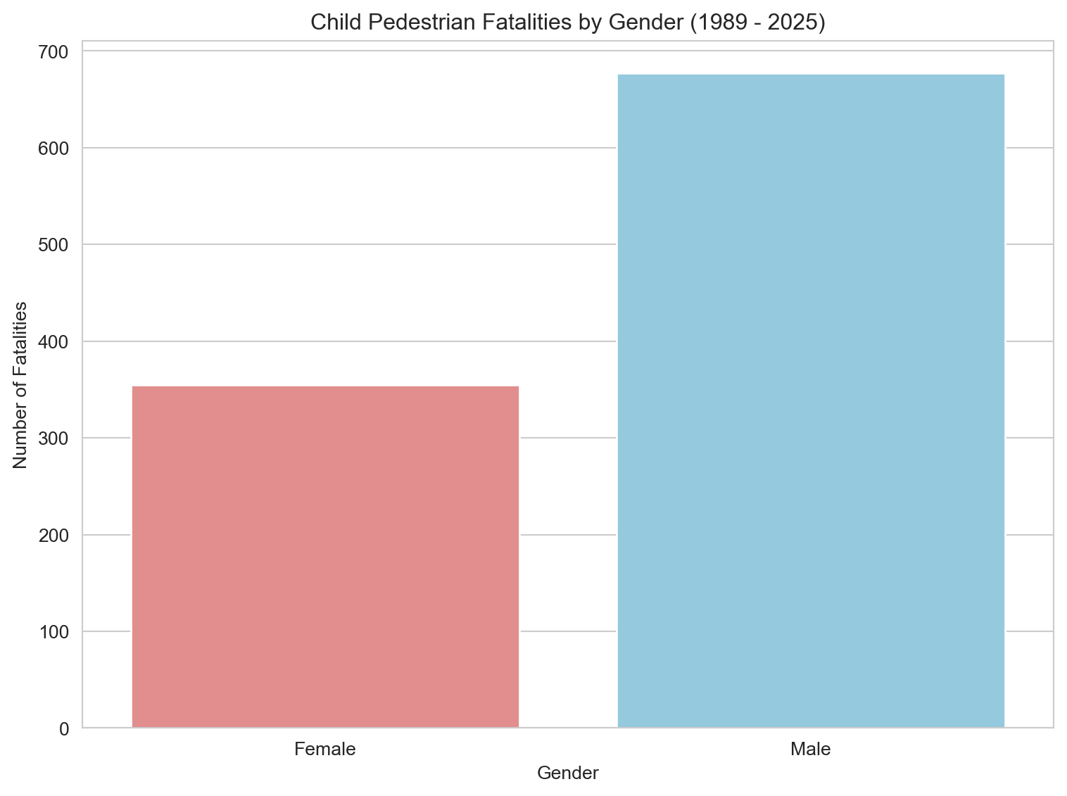
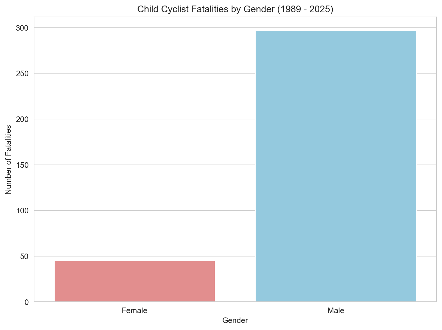
3.3.4 Child Cyclist Fatalities by Gender
Code
# Filter for valid entries in 'Gender'gender_fatalities_cyc = cyclist_children.dropna(subset=['Gender']) # Changed variable name slightly for clarity# Group data by Gender, counting all Crash ID occurrencesgender_count_cyc = gender_fatalities_cyc.groupby('Gender')['Crash ID'].count().reset_index(name='Fatalities')# Plotting a bar plot for Gender breakdownplt.figure(figsize=(8, 6))sns.barplot(x='Gender', y='Fatalities', data=gender_count_cyc, hue='Gender', palette=custom_palette, dodge=False, legend=False)plt.title(f'Child Cyclist Fatalities by Gender ({earliest_year} - {latest_year})') plt.xlabel('Gender')plt.ylabel('Number of Fatalities')plt.tight_layout()plt.show()# Calculate and print the percentage for consistencygender_count_cyc['Percentage'] = (gender_count_cyc['Fatalities'] / gender_count_cyc['Fatalities'].sum()) *100print(gender_count_cyc[['Gender', 'Percentage']])# Notes to self:# - Follow up with participation rate data (e.g., ABS, VicHealth, AusCycle) to contextualize the gender split.# - Consider incorporating qualitative data or surveys on why girls might cycle less (uniforms, parental concerns, social norms).# - Explore literature on gender differences in childhood risk exposure or injury rates.# - Would benefit from a stacked bar or percent-normalized visual if participation data is found.# - Future addition: small multiples by age band to see if the gender gap widens with age.
   Gender  Percentage
0  Female   13.157895
1    Male   86.842105
This bar chart shows a pronounced gender disparity in child cyclist fatalities: 87% of deaths were male, compared to just 13% female. This gap may reflect a combination of factors — from lower cycling participation among girls, to social norms, clothing barriers (e.g., school uniforms), parental attitudes, or differences in risk-taking behavior. The gender imbalance seen here is far greater than in pedestrian fatalities, suggesting a need for further investigation into who is cycling, where, and under what conditions.
4. Conclusion
This analysis shows a clear long-run drop in child pedestrian and cyclist fatalities across Australia from 1989 to 2025. Even with that improvement, risk still clusters by time of day, gender, and location.
Pedestrian deaths fell faster than cyclist deaths, and cyclist fatalities remain heavily concentrated among boys. The repeated afternoon peak around school travel hours also points to where interventions are most likely to matter.
Useful next steps include adding spatial layers (for example, school zones) and mobility trends to understand local context better. Overall, this notebook is intended as an evidence-first starting point for targeted child road safety work.