---
title: "{{< var study_title >}}"
subtitle: "Study Overview"
---
```{r}
#| label: setup
#| include: false
library(here)
library(tidyverse)
library(arrow)
library(broom)
library(patchwork)
source(here("R", "plot_theme.R"))
```
```{r}
#| label: import
#| include: false
df_raw <- read_parquet(here("data", "processed", "analysis_dataset.parquet"))
df <- df_raw |>
mutate(
mod_min_session = if_else(mod_min_session %in% c(7777, 9999), NA_real_, mod_min_session),
vig_min_session = if_else(vig_min_session %in% c(7777, 9999), NA_real_, vig_min_session),
vig_freq = if_else(vig_freq %in% c(7777, 9999), NA_real_, vig_freq),
sedentary_min_day = if_else(sedentary_min_day %in% c(7777, 9999), NA_real_, sedentary_min_day),
mod_freq_per_week = case_when(
mod_freq_unit == "D" ~ mod_freq * 7,
mod_freq_unit == "W" ~ mod_freq,
mod_freq_unit == "M" ~ mod_freq / 4.3,
mod_freq_unit == "Y" ~ mod_freq / 52,
TRUE ~ NA_real_
),
vig_freq_per_week = case_when(
vig_freq_unit == "D" ~ vig_freq * 7,
vig_freq_unit == "W" ~ vig_freq,
vig_freq_unit == "M" ~ vig_freq / 4.3,
vig_freq_unit == "Y" ~ vig_freq / 52,
TRUE ~ NA_real_
),
mod_met = coalesce(mod_freq_per_week * mod_min_session, 0) * 4,
vig_met = coalesce(vig_freq_per_week * vig_min_session, 0) * 8,
total_met = mod_met + vig_met,
log_total_met = log(total_met + 1)
) |>
mutate(
sex = factor(
case_when(sex_raw == 1 ~ "Male", sex_raw == 2 ~ "Female"),
levels = c("Male", "Female")
),
race = factor(
case_when(
race_raw == 1 ~ "Mexican American",
race_raw == 2 ~ "Other Hispanic",
race_raw == 3 ~ "Non-Hispanic White",
race_raw == 4 ~ "Non-Hispanic Black",
race_raw == 6 ~ "Non-Hispanic Asian",
race_raw == 7 ~ "Other/Multiracial"
),
levels = c(
"Non-Hispanic White", "Mexican American", "Other Hispanic",
"Non-Hispanic Black", "Non-Hispanic Asian", "Other/Multiracial"
)
),
education = factor(
case_when(
education_raw == 1 ~ "Less than 9th grade",
education_raw == 2 ~ "9th-11th grade",
education_raw == 3 ~ "High school grad / GED",
education_raw == 4 ~ "Some college / AA degree",
education_raw == 5 ~ "College graduate or above",
education_raw %in% c(7, 9) ~ NA_character_
),
levels = c(
"College graduate or above", "Some college / AA degree",
"High school grad / GED", "9th-11th grade", "Less than 9th grade"
)
),
smoking_status = factor(
case_when(
ever_smoked == 2 ~ "Never",
ever_smoked == 1 & current_smoker == 3 ~ "Former",
ever_smoked == 1 & current_smoker %in% c(1, 2) ~ "Current",
TRUE ~ NA_character_
),
levels = c("Never", "Former", "Current")
),
food_security = factor(
case_when(
food_security_raw == 1 ~ "Fully food secure",
food_security_raw == 2 ~ "Marginally food secure",
food_security_raw == 3 ~ "Low food security",
food_security_raw == 4 ~ "Very low food security"
),
levels = c(
"Fully food secure", "Marginally food secure",
"Low food security", "Very low food security"
)
),
diabetes_flag = factor(
case_when(
diabetes_diagnosis == 1 ~ "Yes",
diabetes_diagnosis %in% c(2, 3) ~ "No",
diabetes_diagnosis %in% c(7, 9) ~ NA_character_
),
levels = c("No", "Yes")
),
poverty_ratio = poverty_raw
)
model_vars <- c(
"sbp", "log_total_met", "sedentary_min_day", "age", "sex", "race",
"education", "waist_cm", "poverty_ratio", "sleep_hours", "smoking_status",
"food_security", "diabetes_flag"
)
df_cc <- df |>
drop_na(all_of(model_vars)) |>
select(id, all_of(model_vars), mec_weight, psu, strata)
model_base <- lm(sbp ~ age + sex + race, data = df_cc)
model <- lm(sbp ~ age + sex + race + log_total_met + sedentary_min_day +
waist_cm + education + poverty_ratio + sleep_hours +
smoking_status + food_security + diabetes_flag,
data = df_cc)
```
Hypertension is a major driver of cardiovascular disease, but simple models based on age and sex don't fully explain why blood pressure varies so much between individuals.
This project uses data from the National Health and Nutrition Examination Survey (NHANES) 2021-2023 to ask how much variation in systolic blood pressure can be explained by social and lifestyle factors like education, income, food security, and physical activity.
::: {.callout-note appearance="minimal"}
**Study snapshot**
| | |
|---|---|
| **Data source** | NHANES 2021-2023 ({{< var nhanes_cycle >}}) |
| **Analytical sample** | `r nrow(df_cc)` adults (complete cases) |
| **Outcome** | Systolic blood pressure (mmHg) |
| **Predictors** | 12 variables across demographics, SDoH, and lifestyle |
| **Method** | Multiple linear regression: base demographic model vs. full SDoH model |
:::
---
## Key Findings
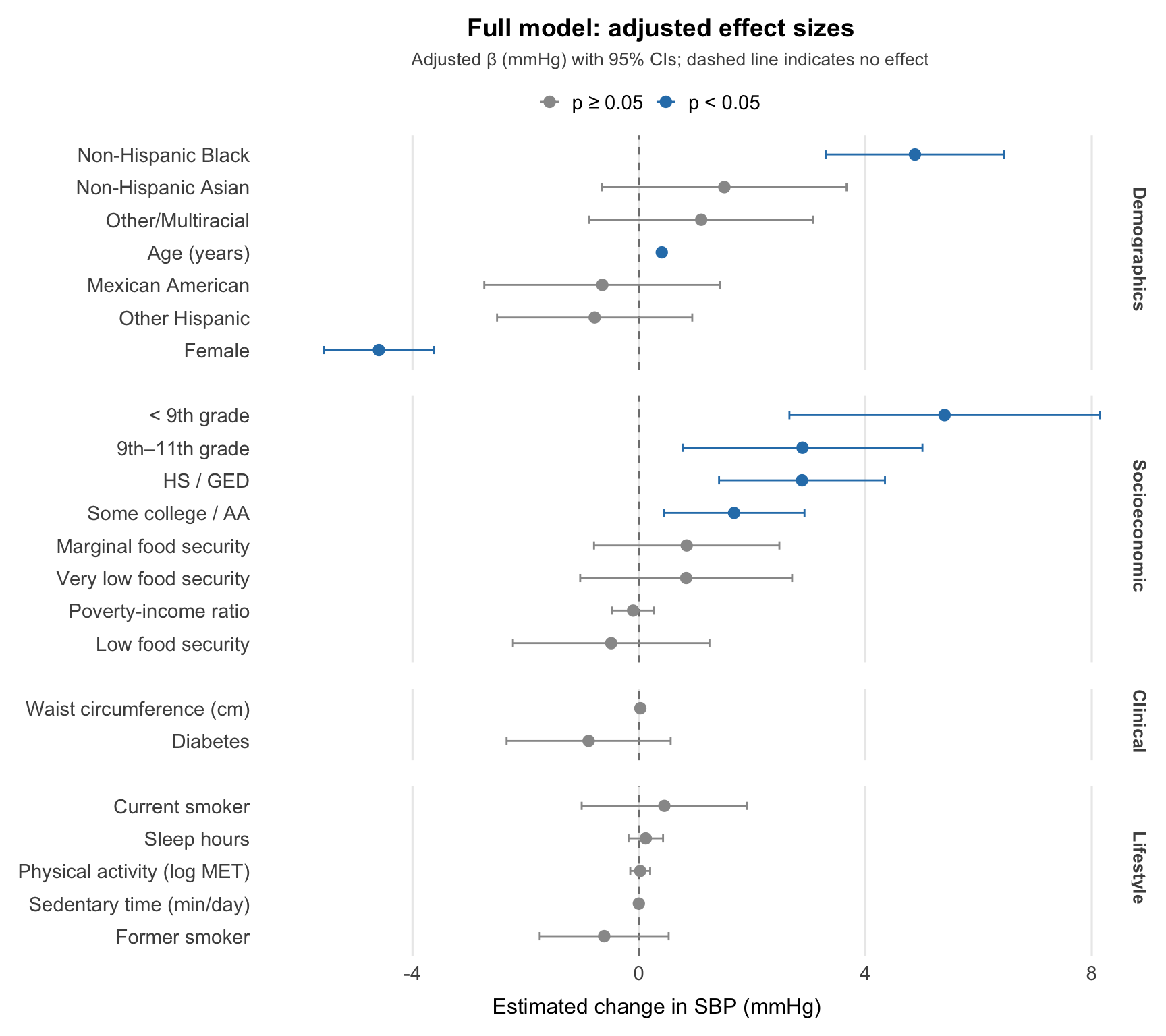
Age is the strongest predictor. Each additional year is associated with a +0.40 mmHg increase in SBP, and this holds steady after adjusting for social and lifestyle factors, pointing to a primarily biological relationship.
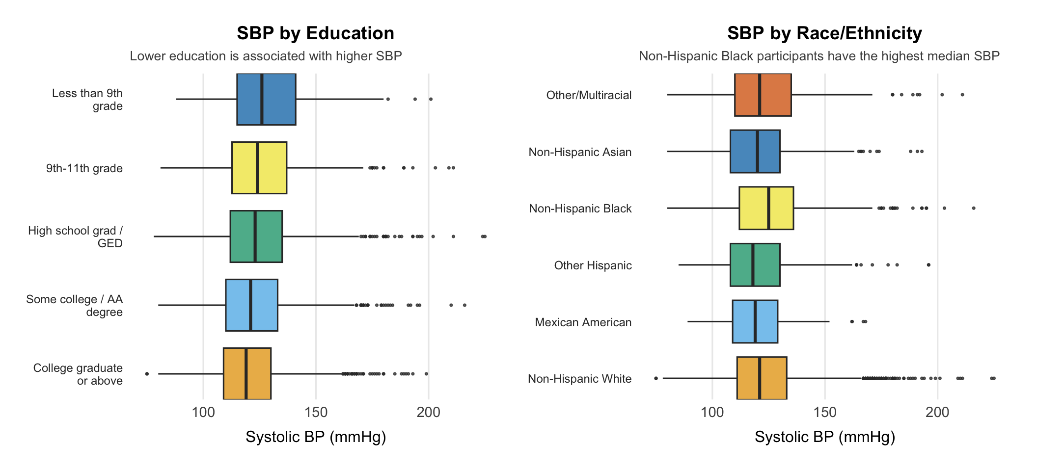
Education stands out among social factors. After full adjustment, participants with less than a 9th grade education had SBP 5.4 mmHg higher than college graduates. It was the only socioeconomic variable that stayed significant in the full model.
Racial disparity remains after adjustment. Non-Hispanic Black participants had SBP 4.9 mmHg higher than Non-Hispanic White participants, a gap the social determinants in the model did not explain.
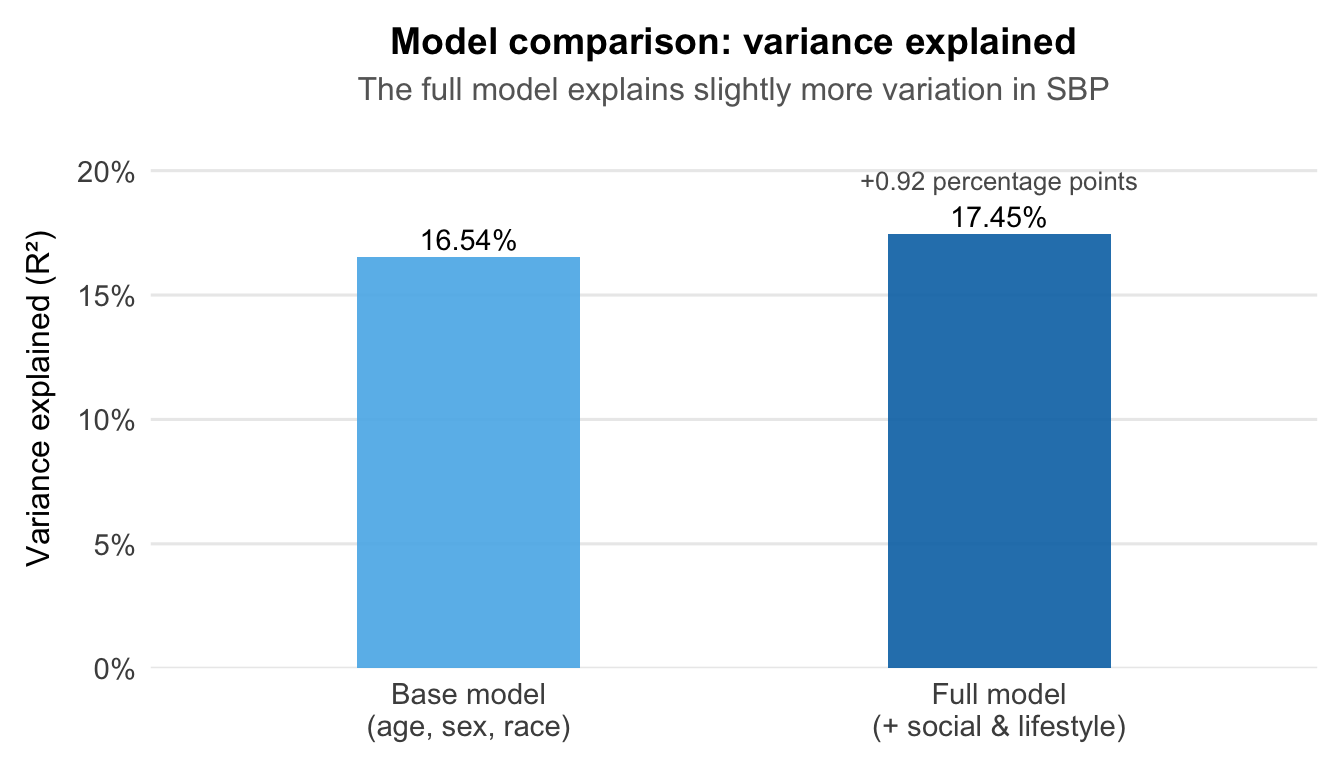
Social factors add limited explanatory power. The full model explained 17.45% of SBP variance versus 16.54% for demographics alone, a modest gain that likely reflects missing variables such as antihypertensive medication use.
Smoking effect driven by age. Former smokers showed higher SBP before adjustment (+3.3 mmHg), but this disappeared once age was accounted for, confirming the crude association was confounded.
---
## SBP by Key Social Determinants
```{r}
#| label: fig-sbp-sdoh
#| fig-width: 11
#| fig-height: 5
#| warning: false
p_edu <- ggplot(df_cc, aes(x = sbp, y = education, fill = education)) +
    geom_boxplot(alpha = 0.75, outlier.size = 0.6) +
    scale_fill_epi() +
    scale_y_discrete(
        labels = function(x) stringr::str_wrap(x, width = 18),
        expand = expansion(mult = c(0.05, 0.05))
    ) +
    labs(
        title    = "SBP by Education",
        subtitle = "Lower education is associated with higher SBP",
        x        = "Systolic BP (mmHg)",
        y        = NULL
    ) +
    theme_epi(grid = "x") +
    theme(
        legend.position = "none",
        plot.title = element_text(
            hjust = 0.5,
            size  = 14,
            face  = "bold"
        ),
        plot.subtitle = element_text(
            hjust      = 0,
            size       = 10,
            colour     = "grey30",
            lineheight = 1.1
        ),
        axis.text.y = element_text(
            size   = 9,
            colour = "grey20",
            margin = margin(r = 4)
        )
    )

p_race <- ggplot(df_cc, aes(x = sbp, y = race, fill = race)) +
    geom_boxplot(alpha = 0.75, outlier.size = 0.6) +
    scale_fill_epi() +
    scale_y_discrete(
        labels = function(x) stringr::str_wrap(x, width = 18),
        expand = expansion(mult = c(0.05, 0.05))
    ) +
    labs(
        title    = "SBP by Race/Ethnicity",
        subtitle = "Non-Hispanic Black participants have the highest median SBP",
        x        = "Systolic BP (mmHg)",
        y        = NULL
    ) +
    theme_epi(grid = "x") +
    theme(
        legend.position = "none",
        plot.title = element_text(
            hjust = 0.5,
            size  = 14,
            face  = "bold"
        ),
        plot.subtitle = element_text(
            hjust      = 0,
            size       = 10,
            colour     = "grey30",
            lineheight = 1.1
        ),
        axis.text.y = element_text(
            size   = 9,
            colour = "grey20",
            margin = margin(r = 4)
        )
    )

p_edu | p_race
```
The education gradient (left) was the clearest social signal after adjustment. The racial disparity (right) also persisted, likely driven by factors this model doesn't capture.
---
## Regression Results
### Adjusted effect sizes: full model
```{r}
#| label: fig-forest-full
#| fig-width: 9
#| fig-height: 8
label_map <- c(
    "age"                                  = "Age (years)",
    "sexFemale"                            = "Female",
    "raceMexican American"                 = "Mexican American",
    "raceOther Hispanic"                   = "Other Hispanic",
    "raceNon-Hispanic Black"               = "Non-Hispanic Black",
    "raceNon-Hispanic Asian"               = "Non-Hispanic Asian",
    "raceOther/Multiracial"                = "Other/Multiracial",
    "educationSome college / AA degree"    = "Some college / AA",
    "educationHigh school grad / GED"      = "HS / GED",
    "education9th-11th grade"              = "9th-11th grade",
    "educationLess than 9th grade"         = "< 9th grade",
    "poverty_ratio"                        = "Poverty-income ratio",
    "food_securityMarginally food secure"  = "Marginal food security",
    "food_securityLow food security"       = "Low food security",
    "food_securityVery low food security"  = "Very low food security",
    "waist_cm"                             = "Waist circumference (cm)",
    "diabetes_flagYes"                     = "Diabetes",
    "log_total_met"                        = "Physical activity (log MET)",
    "sedentary_min_day"                    = "Sedentary time (min/day)",
    "sleep_hours"                          = "Sleep hours",
    "smoking_statusFormer"                 = "Former smoker",
    "smoking_statusCurrent"                = "Current smoker"
)

group_map <- c(
    "age"                                  = "Demographics",
    "sexFemale"                            = "Demographics",
    "raceMexican American"                 = "Demographics",
    "raceOther Hispanic"                   = "Demographics",
    "raceNon-Hispanic Black"               = "Demographics",
    "raceNon-Hispanic Asian"               = "Demographics",
    "raceOther/Multiracial"                = "Demographics",
    "educationSome college / AA degree"    = "Socioeconomic",
    "educationHigh school grad / GED"      = "Socioeconomic",
    "education9th-11th grade"             = "Socioeconomic",
    "educationLess than 9th grade"         = "Socioeconomic",
    "poverty_ratio"                        = "Socioeconomic",
    "food_securityMarginally food secure"  = "Socioeconomic",
    "food_securityLow food security"       = "Socioeconomic",
    "food_securityVery low food security"  = "Socioeconomic",
    "waist_cm"                             = "Clinical",
    "diabetes_flagYes"                     = "Clinical",
    "log_total_met"                        = "Lifestyle",
    "sedentary_min_day"                    = "Lifestyle",
    "sleep_hours"                          = "Lifestyle",
    "smoking_statusFormer"                 = "Lifestyle",
    "smoking_statusCurrent"                = "Lifestyle"
)

coef_full <- tidy(model, conf.int = TRUE) |>
    filter(term != "(Intercept)") |>
    mutate(
        label       = label_map[term],
        group       = factor(group_map[term],
                             levels = c("Demographics", "Socioeconomic",
                                        "Clinical", "Lifestyle")),
        significant = p.value < 0.05,
        label       = fct_reorder(label, estimate)
    )

get_zero_hjust <- function(xmin, xmax) (0 - xmin) / (xmax - xmin)

ggplot(coef_full, aes(x = estimate, y = label, color = significant)) +
    geom_vline(xintercept = 0, linetype = "dashed", colour = "grey50", linewidth = 0.5) +
    geom_errorbar(aes(xmin = conf.low, xmax = conf.high),
                  orientation = "y", width = 0.25, linewidth = 0.5) +
    geom_point(size = 2.5) +
    facet_grid(group ~ ., scales = "free_y", space = "free_y") +
    scale_color_manual(
        values = c("FALSE" = "grey60", "TRUE" = "#2C7FB8"),
        labels = c("FALSE" = "p ≥ 0.05", "TRUE" = "p < 0.05")
    ) +
    coord_cartesian(xlim = c(-6, 8)) +
    labs(
        title    = "Full model: adjusted effect sizes",
        subtitle = "Adjusted β (mmHg) with 95% CIs; dashed line indicates no effect",
        x        = "Estimated change in SBP (mmHg)",
        y        = NULL,
        color    = NULL
    ) +
    theme_epi(grid = "x", legend_position = "top") +
    theme(
        strip.text       = element_text(face = "bold", colour = "grey30", size = 10),
        plot.title       = element_text(hjust = get_zero_hjust(-6, 8), face = "bold", size = 14),
        plot.subtitle    = element_text(hjust = get_zero_hjust(-6, 8), size = 10, colour = "grey30"),
        legend.justification = c(get_zero_hjust(-6, 8), 0),
        axis.title.x         = element_text(hjust = get_zero_hjust(-6, 8))
    )
```
The plot shows adjusted effects on systolic blood pressure, with significant estimates highlighted in blue.
### Incremental R²: does adding SDoH matter?
```{r}
#| label: fig-r2-comparison
#| fig-width: 7
#| fig-height: 4
r2_data <- tibble(
    model_name = factor(
        c("Base model\n(age, sex, race)", "Full model\n(+ social & lifestyle)"),
        levels = c("Base model\n(age, sex, race)", "Full model\n(+ social & lifestyle)")
    ),
    r_squared = c(
        summary(model_base)$r.squared,
        summary(model)$r.squared
    )
)

delta_r2 <- (summary(model)$r.squared - summary(model_base)$r.squared) * 100

ggplot(r2_data, aes(x = model_name, y = r_squared, fill = model_name)) +
    geom_col(width = 0.42, alpha = 0.9) +
    geom_text(
        aes(label = scales::percent(r_squared, accuracy = 0.01)),
        vjust = -0.35,
        size = 3.8,
        fontface = "plain"
    ) +
    annotate(
        "text",
        x = 2, y = 0.196,
        label = sprintf("+%.2f percentage points", delta_r2),
        size = 3.4,
        color = "grey35"
    ) +
    scale_fill_manual(values = unname(palette_epi[c("sky_blue", "blue")])) +
    scale_y_continuous(
        labels = scales::percent_format(accuracy = 1),
        limits = c(0, 0.215),
        expand = expansion(mult = c(0, 0.01))
    ) +
    labs(
        title    = "Model comparison: variance explained",
        subtitle = "The full model explains slightly more variation in SBP",
        x        = NULL,
        y        = "Variance explained (R²)"
    ) +
    theme_epi(grid = "y") +
    theme(
        legend.position = "none",
        plot.title = element_text(hjust = 0.5),
        plot.subtitle = element_text(hjust = 0.5)
    )
```
The full model explains slightly more variation in SBP, but the gain is modest: social and lifestyle factors add less than one percentage point beyond demographics alone.
---
## Explore Further
For more detail:
- [Exploratory Data Analysis](eda.qmd): how blood pressure varies across key demographic and social groups before modelling
- [Multiple Linear Regression](regression.qmd): the full model, including variable selection, diagnostics, and adjusted effect estimates